
Cadillac brand development
Works
- 2010
- Brand, identity, etc.
- General Motors
- Cadillac brand development
During the winter of 2009, we were asked to join a team of creatives led by Alicia Johnson and Hal Wolverton to pitch General Motors’ Cadillac marque on behalf of the British advertising agency Bartle Bogle Hegarty. BBH had little experience in the automotive or luxury sectors at that point, and Johnson+Wolverton had plenty of both, notably in their recent resurrection of the Jaguar brand.
Cadillac was ripe for similar treatment. Its managing director at that time, Bryan Nesbitt, was young and was already a storied designer in Detroit, having created counterintuitive and successful models for Chrysler (the PT Cruiser, love it or hate it) and Chevrolet (the similar HHR; same proviso). For Cadillac, Nesbitt was making interesting cars (the modern CTS line with its V variants), and he and his patron, GM chairman Bob Lutz, wanted a brand that called to mind Cadillac’s swaggering past: the 1950s and ’60s.
Illustrations
1.
Pitch film
An anthem piece to show GM senior execs how the creative should look and act. It acknowledges the brand’s fallen status without excuse, showing a new path toward renewal for the company and, for that matter, all Americans. These senior execs gave our presentation a standing ovation, and Lutz himself told us it was the strongest stuff GM had seen since the 1960s. We won the account.
We found out later, of course, that it is middle managers who make the rockin’ world go ’round, and they didn’t care for it much; or, we should say, they didn’t want the trouble an attitudinal change of this magnitude would require. A couple of months into production, GM forced Lutz out of his chairmanship; Nesbitt was relieved of his command and replaced with career GM marketing managers from the Chevrolet and Pontiac brands.
We were well aware that the new management team would be skeptical at best of the creative direction. This is normal; they hadn’t bought it—their predecessors had. Still, we produced our first deliverables, and if they were a bit more—shall we say—conservative than our initial ideas, that was to be expected.
A few months later, GM reorganized again, this time bringing in a new chief marketing officer from outside the company, who brought his own people along, and shortly after that we were dismissed, and the work was ultimately awarded to Fallon. (They held on to it for about as long as we did, and then were replaced by Hill Holliday.)
So it goes. This film, and the work following, exist largely to show what might have been.
2.
Brand language
2.1
Working style guide
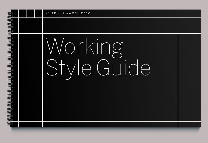
While this document delves a bit into specifics, it is more philosophical treatise than standards manual, showing GM in-house folks and selected partners how the traditional Cadillac brand accoutrements would be deployed and also telling them why. We certainly didn’t expect to be producing every bit of communication for the company; this document allowed us to share the campaign’s underpinnings with those who would, and also gave us a place to codify and keep them for ourselves. On a project of this scale and velocity, you make up a lot of things as you go along; which is fine, as long as you remember what they were and why you did them.
2.2
Marks
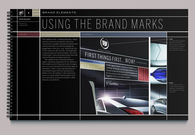
Previous brand language emphasized the Cadillac script, which was based upon the handwriting of Antoine Laumet de La Mothe, Sieur de Cadillac; we put it back in its place as a signature and traded instead on the shield (based upon La Mothe’s family coat of arms), which we used as a finial on all communications. Shield first, up top; then argument; then signature.
2.3
Shield
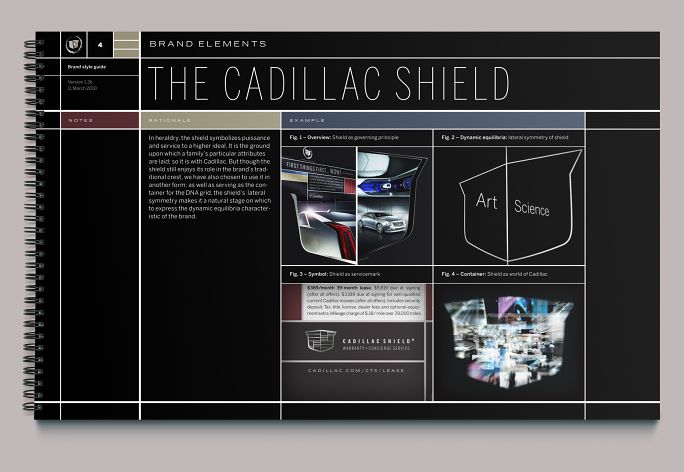
We also saw the shield as a governing form or container for content. Its lateral symmetry made it useful, when abstracted, to convey the “dynamic equilibria” of art and science. All of the creative made a point of balancing these two concepts: the enclosing form of the shield kept them orderly.
2.4
DNA grid
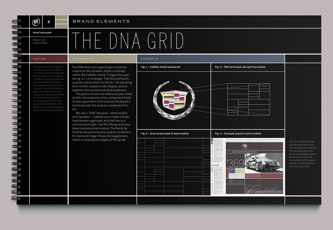
Moreover, the heraldic divisions within the shield could be used to create an Eames-type Wunderkammer into which we placed smaller arguments. This is a direct reference to the modernist design language of the mid–20th century, arguably the last time American industry felt totally confident. We called it “DNA” because it was easily scaled and repeated to create visuals that behaved organically and still held to a common principle.
2.5
Using the grid
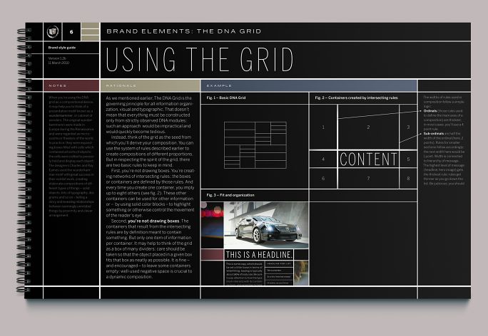
Guidelines on abstracting and using the DNA grid. While we wanted every composition to start from the root grid, we knew that insisting that the whole thing must adhere to the root would quickly grow tedious and unworkable. For the most part, it was a guideline; good executions would reference the grid as a cue, without being slavish.
2.6
Typography
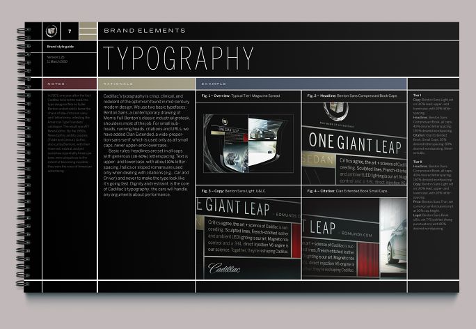
The principal typeface for the brand was Benton Sans, Frére-Jones and Highsmith’s redesign of News Gothic, the original of which was a mainstay in midcentury modern communications design. We also commissioned Font Bureau to draw extended versions of eight weights.
2.7
Tier II print
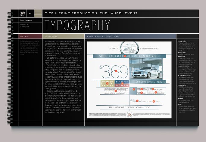
For the uninitiated, Tier II advertising means retail: the print and broadcast ads with a dollar figure and a dealer name attached to them. Brand agencies typically hate Tier II; they consider it vulgar and uncreative.
But it’s an open secret in the industry that image advertising doesn’t really move cars, and Tier II does. Johnson+Wolverton—educated by their long experience with the Jaguar brand—knew this, and so we spent quite a bit of time developing creative guidelines for Tier II. Ironically, it was the dealers who were happiest with our work; they were amazed and grateful that someone at the corporate level was taking them seriously.
2.8
Tier II print detail
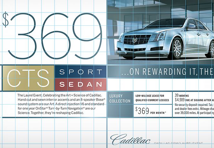
GM and its dealers produce tons of Tier II ads, especially in print. These ads show up in hundreds of publications, all of which have slightly different page sizes and production guidelines. Each ad has to be customized for each publication. It’s a lot of handwork; there are a multitude of moving parts, and lots of opportunity to get it wrong.
We came up with a system to help. Because we were working on the Tier I (or brand) stuff at the same time, we could make sure that whatever we developed would fit gracefully within a defined geometry, and in such a way that the elements could be clicked together like Legos. The base module here was a half-inch square (something any newspaper could deal with), and each element in the tool kit (number, headline, model badge) occupied a certain number of squares. When an ad needed to be resized, the production artist could estimate the live area to the nearest half inch, drop the elements on the grid, and move them around with the cursor keys.
3.
Collateral
In 2010, General Motors was in bankruptcy; to the further chagrin of its management, its largest shareholder was the United States government. They were timid about appearing to spend money, even—or perhaps especially—on a luxury marque. In place of the larger, flashier books that dealers would dangle in front of prospective customers, we developed a series of smaller twelve-page brochures. Though modest in scale, these are written well by our old friend Timothy Leigh, and printed beautifully (under the exacting eye of BBH print boss Lauren Abbott Fertitta).
In response to the austerity imposed by GM’s bankruptcy, Johnson+Wolverton structured the overall brand project (discussed above) around the creation of a library of photographic and film assets to be used for the two years of the Art+Science campaign. (Automakers typically change out styles every two years, so the cars we documented would be around that long.) Creating this library up front would do two things: ensure consistent art direction across the campaign and guarantee that the tedium of the approval process would be a memory when the time came for applications like these brochures.
This approach also suited the Wunderkammer motif at the root of the brand language. We could quickly assemble visual arguments out of disparate images and stitch them together with pithy language that was more like captioning than formal copy. As with most brands, the product is always the real story, anyway; this campaign cut out the middleman.
3.1
Covers
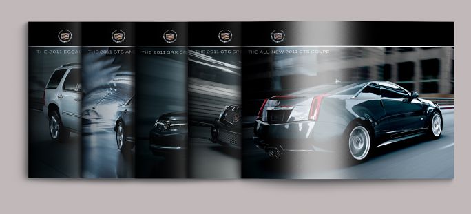
An example of the brand language in practice: a stripped-down reading of the DNA grid (see figure 2.4 above); a small, finial-style application of the crest. Type is restrained, but large enough to be legible. The emphasis is on product, in this case—at front—the V Coupe, as photographed by John Higginson.
3.2
Overview
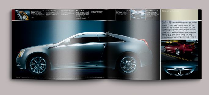
That emphasis carries through the text. Language is limited to callouts distributed along the top of the page and a short informational paragraph printed on a background of metallic silver and gold. The rest is all image. The magnificent profile shot of the CTS Coupe was made by Peter Jennings, the running shot by John Higginson, the details by Shu Akashi.
3.3
Interiors
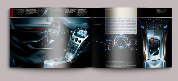
Brochures followed a simple structure, moving from exterior to interior and back again. Photography here is by Michael Ruppert (shifter at right by Shu Akashi).
3.4
CTS-V overview
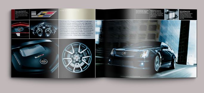
A good example of how the Wunderkammer motif allowed us to move inside, outside, and around the car in one paragraph and two pages. Running shot by John Higginson; detail images by Shu Akashi.
3.5
CTS-V interior
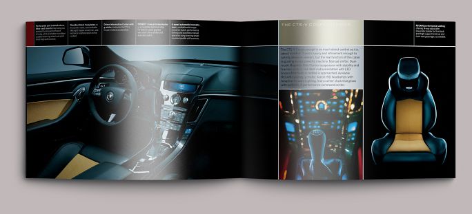
Cockpit by Michael Ruppert; details by Shu Akashi. Sharp-eyed typophiles will note that our rags aren’t up to their usual standard. Large brands don’t like hyphenation (for no other reason, we found, other than that there was always someone in a meeting who would notice it and, lacking anything else to offer the table, bring it up; much effort goes into making items that will be discussed in a meeting as frictionless as possible). Once a piece of copy is approved, it usually isn’t rewritten unless the lawyers find something troublesome in it.
3.6
Odds & ends
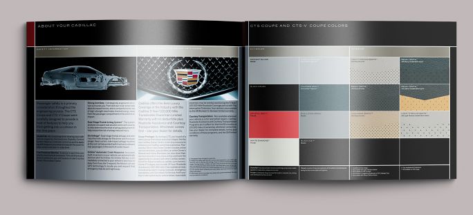
Safety and warranty information faced with color and upholstery choices. Each of the available colors was printed in a custom metallic or flake ink, even the black.
3.7
Odds & ends
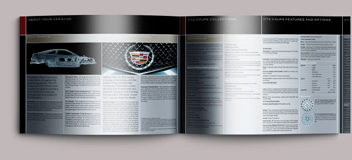
The back cover was a gatefold; swing open the color chip page, and you’ll find the technical specifications and various levels of available chrome.
Colophon
Collateral:
Each 12 pp. + gatefold
10 × 7⅓ in
Printed in fourteen colors (4c + 10 match) colors on coated paper
Saddle-stitched
Composed in Benton Sans (including commissioned wide weights)
- Agency
- Johnson+Wolverton
- Bartle Bogle Hegarty
- Creative directors
- Alicia Johnson
- Hal Wolverton
- Art directors
- Patrik Bolecek
- Keira Alexandra
- Ian Boyle
- Peter Jennings
- Adam McIsaac
- Donjiro Ban
- Designer (collateral)
- Adam McIsaac
- Copywriters
- Alicia Johnson
- Keith Klein
Timothy Leigh (collateral) - Photographers (collateral)
- Patrik Bolecek
- Peter Jennings
- John Higginson
Michael Ruppert
Shu Akashi - Editor
- Neil J. Gust
- Animation
- Kiffer Keegan
- CG
- Jack Ehrbar
- Production (collateral)
- Lauren Abbott Fertitta