Dr. Bronner’s: 2015 All-One Report
Works
- 2015
- Books / editorial
- Dr. Bronner's
- 2015 All-One Report
To coincide with the packaging reset led by Studio Jelly, Dr. Bronner’s published its first All-One Report, a free-range and idiosyncratic take on the now-ubiquitous corporate social responsibility report (CSR). As a private, family-held corporation, Dr. Bronner’s was not required by law to file a CSR, but the company—a longtime champion of fair trade and organic farming practices—wanted to make its sustainability story public and asked Studio Jelly to have a look at such a report. The studio counseled that since Dr. Bronner’s does not advertise, it needed some way to communicate its values and extensive corporate citizenship activities to its constituents: customers, vendors, partners, employees. Sustainability is only part of the Dr. Bronner’s story.
The inaugural All-One Report was a fifty-six-page tabloid, printed in color on recycled newsprint by a family-owned web press in Oregon’s Willamette Valley, and wrapped in a two-sided poster. Comprising twenty-five short articles, it told the story of the company’s history and current activities not through an omniscient narrator, but in the voices of its own employees from around the world, punctuated by well-chosen excerpts from Dr. Bronner’s exegesis The Moral ABC.
This first report had to make up for lost time, illustrating the whole of Dr. Bronner’s practices as defined by their six “Cosmic Principles.” Subsequent issues of the report—there have been five as of this writing—are more compact and focus on a particular area of the company’s interest: for example, 2018’s issue was concerned with regenerative agriculture.
Illustrations
1.
Cover
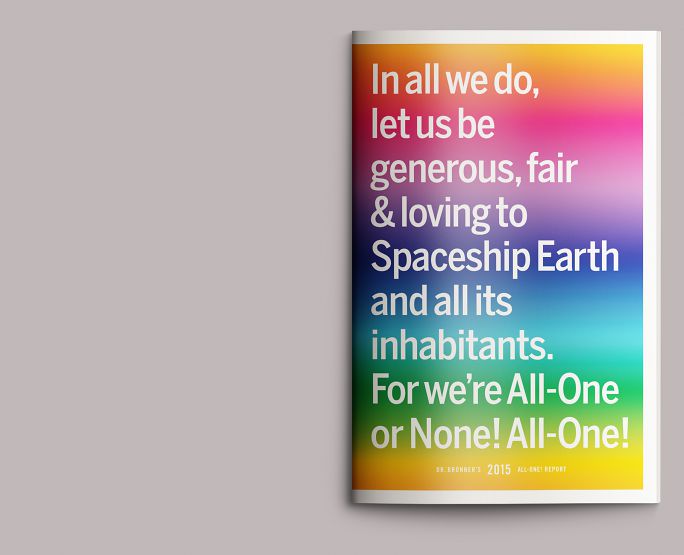
The Dr. Bronner’s statement of purpose—a distillation of the founder’s writings referred to in-house as “the prayer”—first appeared on its packaging in 2014. The All-One Report was more or less its public introduction, set against a spectrum derived from the company’s various product colors.
2.
Frontispiece & preface
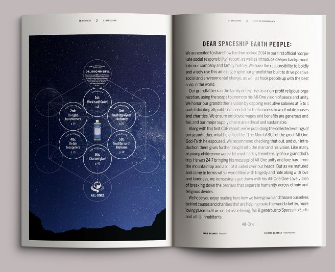
The book opens with an illustration of Metatron’s cube, a bit of sacred geometry that contains all of the platonic solids and that Dr. Bronner’s in-house designer Marty Kenney used as the basis of an earlier revision of the hands-and-globe service mark seen at bottom. Here it’s deployed as a table of contents, faced with a short preface written in the Bronner brothers’ typical freewheeling style.
3.
Introduction
Portrait of Dr. Bronner himself from the early 1970s, from a story in Newsweek, we believe. The fog along the bottom was an inspired addition by that photographer, not us, though if you’ve got it, you may as well flaunt it. David Bronner, Dr. Bronner’s grandson and the company’s CEO (“Cosmic Engagement Officer”), wrote a brief family history to open the report.
4.
Timeline
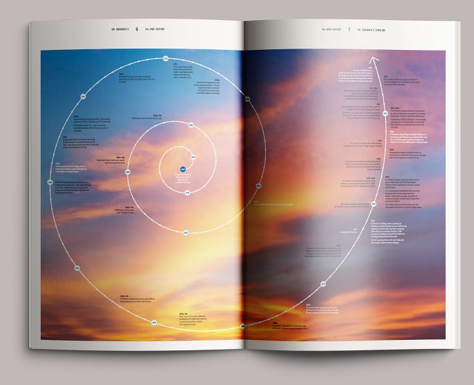
An abridged history of Dr. Bronner’s from its founder’s birth through the present day. Designer Alex Harris hit upon the idea to render it as a spiral, which allowed us to get it all on two pages and also seems consistent with the company’s temperament.
5.
Section opening
The text is structured around the company’s six Cosmic Principles as laid out in the frontispiece, with each principle assigned a color. The linework from the appropriate area of Metatron’s cube reprises, quietly, in the background.
For Dr. Bronner’s, the packaging reset of 2013–14 represented a recommitment to The Moral ABC. Prior years had seen new products come to market with the familiar minuscule type turned to marketing or other purposes. Now, The Moral ABC had returned to its proper place as the brand’s lodestone and began to seep into other, new places. This first All-One Report contains the entirety of part 1 of The Moral ABC, seen as a frame around text pages and as dividers between articles.
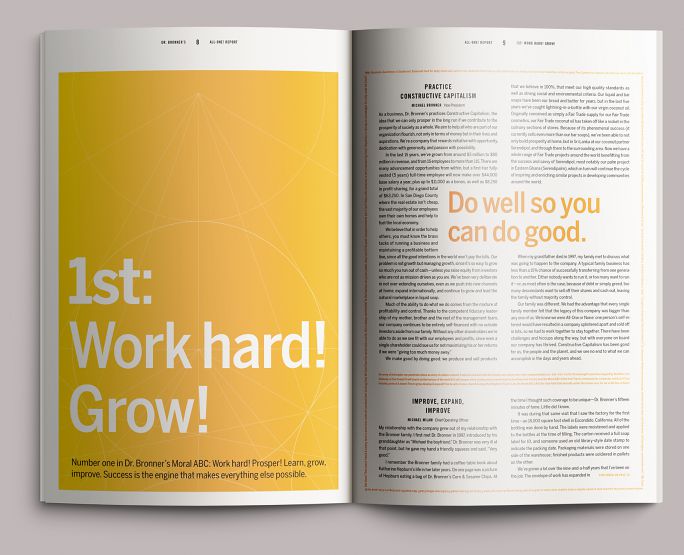
7.
Section interior
Fifty-six pages is a longish document, and though the text type is pretty big, it’s still a lot of reading. We used terse, inset excerpts from the text to sketch the narrative across each section, set big so that you couldn’t help but read them.
8.
Section interior
In some cases, these excerpts took up most of the spread. Students of graphic design history may be seeing the influence of Tibor Kalman’s work on Interview here. It was not intentional, but if you’re going to steal, steal from the best.
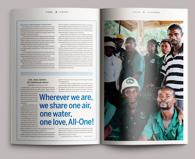
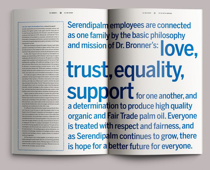
9.
Section imperative
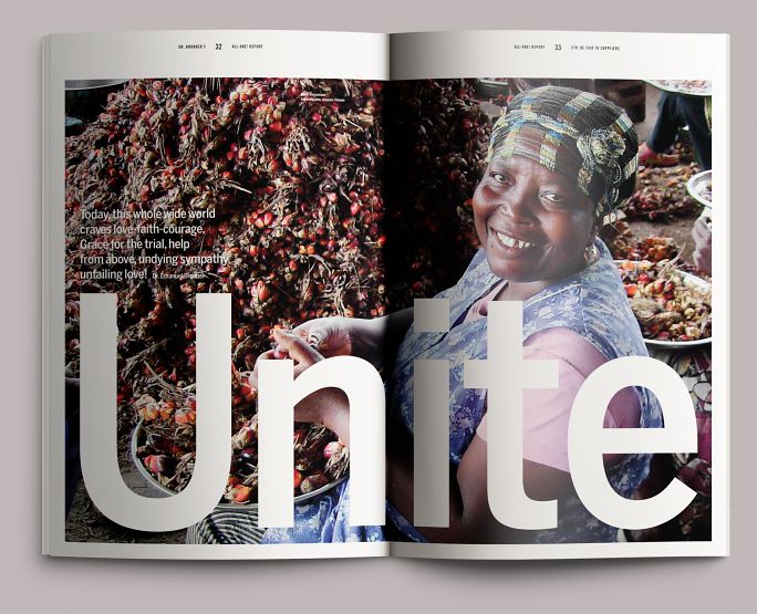
We punctuated each section with large active words and excerpts taken from Dr. Bronner’s writing, illustrated with pictures of the Bronner family, their employees, and their community. Shown here is Akua Sarpomaa, an employee of Dr. Bronner’s Serendipalm project in Ghana.
10.
Numbers

The company’s business performance and sustainability information, as well as an examination of its charitable giving, are expressed in tables and charts color-coded to the appropriate area.
Colophon
56pp. + cover
11⅜ × 17.5 in., ed. 15,000
4-color heat-set web printing on recycled newsprint (text); 4-color sheetfed offset printing on coated paper (cover)
Composed in Benton Sans and Trade Gothic No. 20
- Agency
- Studio Jelly
- Creative director
- Jelly Helm
- Designers
- Adam McIsaac
- Alex Harris
- Writer & editor
- Kathleen Lane
- Printing
- Oregon Web Press (text)
QSL Print Communications (cover)