Dr. Bronner’s: Brand language
Works
- 2014
- Brand, identity, etc.
- Dr. Bronner's
- Old & Improved campaign language
Dr. Bronner’s, the maker of the top-selling soap in the US natural goods market, is a reasonably large business, with more than $120 million in annual revenue. When he started selling soap, Dr. Bronner himself designed his product labels; and from the inception of the modern Dr. Bronner’s in 1948 to this day, the company has tended to do almost everything in-house. But while Studio Jelly was codifying and resetting the Dr. Bronner’s packaging in 2014, it was also looking into their overall communications platform.
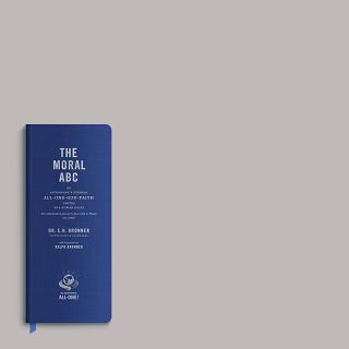
The packaging reset was characterized by a recommitment to founder Emanuel Bronner’s life’s work, The Moral ABC. Historically, what little advertising Dr. Bronner’s did was limited to retail, and The Moral ABC was kept to the bottles. But one outcome of the long packaging process was the acceptance of the fact that The Moral ABC is the Dr. Bronner’s brand. It is indivisible from the company’s products and the way it operates.
So how do you express a free-range crypto-humanist testimony that gathers elements from all of the major religions and unifies them under the principles of hard work, personal responsibility, and social engagement? Stock photography? What could we do for the first campaign?
Illustrations
1.
Product & language

One way is to lead with product. Every Dr. Bronner’s product is photographed the same way: dead-on, clean, well-lit, but without fussiness. In these trade ads, the layout is as spare as the label is dense. Display type is small and reticent; the bottle is the headline. Along the bottom is a tidy block containing copy, current retail opportunities, the gallery of certifications, the logo, and the prayer. But around the edge of the page is a line from The Moral ABC, set in the same size as on the 32 oz. bottle (a motif we carried over to that year’s inaugural All-One Report).
2.
Outreach
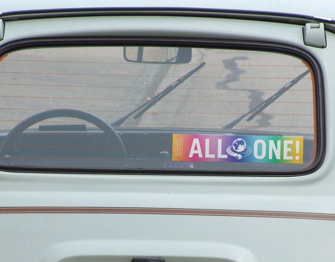
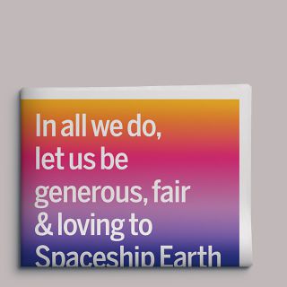
We took the exclamation “All-One!” from the product label, blew it up, and used it to seed new applications, starting with a simple bumper sticker.
3.
Point-of-purchase
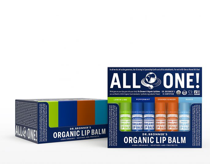
We then applied it to the company’s display cartons—here, a forty-eight-pack of lip balm that opens into its own display case—and then, faced with what to do with the rest of the space, we reasoned that since Dr. Bronner had filled every available surface of every available package with The Moral ABC, he would likely do the same here.
4.
Language block

This led to approaching The Moral ABC in a new way: still filling every space, but breaking the wall of text by excerpting parts, setting them dynamically but with rigor: the same type family, mortised together and spaced as carefully and evenly as possible, feeding the eye quickly but also rewarding longer reading.
5.
Product brochure
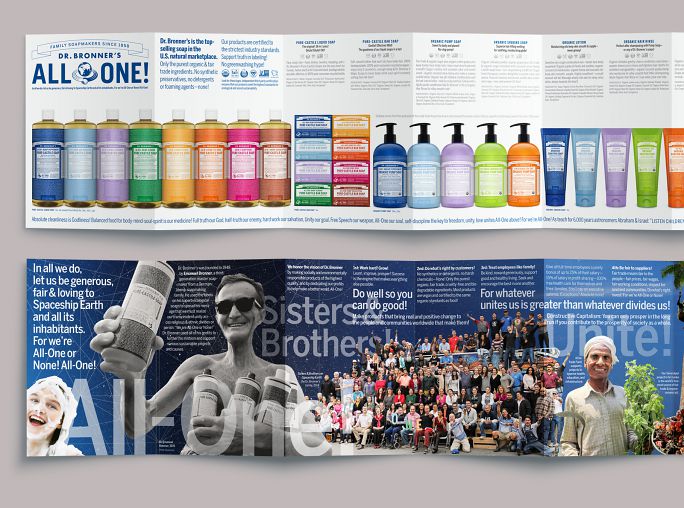
This also meant that we could use The Moral ABC as a ground for other language. Here, in a compact product brochure, the back side explains the culture of Dr. Bronner’s in eight terse paragraphs along the top. Germane excerpts from The Moral ABC move in front of and behind these paragraphs, and also wrap around them, in a manner that references the traditional appearance of The Moral ABC (that is, all crammed together in a small space), but that ushers the eye along.
6.
Promotional packaging
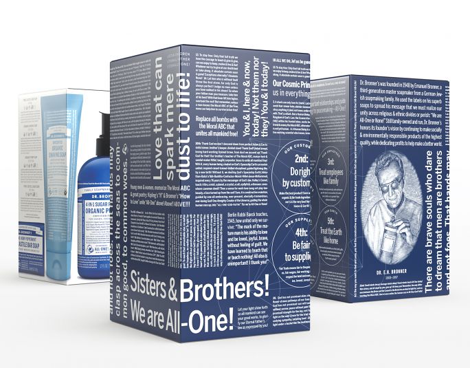
This box, designed as a gift-set liner for Dr. Bronner’s Australia, shows how the language block works in three dimensions. This one is a bit of a pastiche, including the company’s Cosmic Principles (as first set out in its inaugural All-One Report) and an engraving of the doctor created by Stephen Noble for the official Moral ABC. The leftmost image shows the gift set with a bellyband slipped over it: four products for Father’s Day.
7.
Promotional packaging
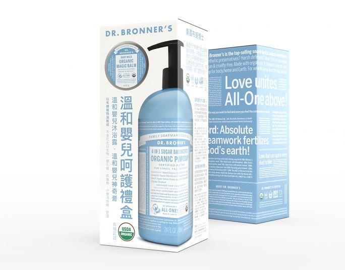
This set, designed for new mothers, uses a similar approach: product on two sides, selections from The Moral ABC on the other two.
8.
Vehicle livery
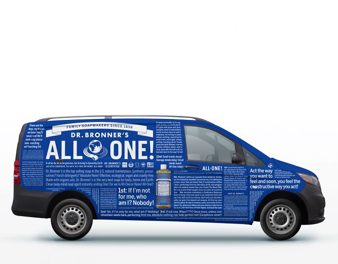
Allover wrap designed for Dr. Bronner’s Ireland integrates product language and The Moral ABC.
Colophon
Composed in various weights of Benton Sans and Trade Gothic No. 20
- Agency
- Studio Jelly
- Creative directors
- Jelly Helm
- Designers
- Adam McIsaac
- Alex Harris
- Writer
- Kathleen Lane
- Illustrator
- Stephen Noble