Jack Ryan: The Lost Chord
Works
- 2017
- Books / editorial
- Art Gym
- Jack Ryan: The Lost Chord
A catalog documenting Jack Ryan’s 2017 solo show, which was curated by Blake Shell for the Art Gym. The show’s title—and the book’s—refers to the mystic, or Prometheus, chord, a six-note synthetic chord ostensibly invented by Alexander Scriabin: the exhibition contained a huge wind chime Ryan fabricated and tuned to its notes. More generally, Ryan’s work examines nonintuitive sources of sound, especially the harmonics caused by overlapping frequencies, both in and of themselves and as broader metaphors for human interaction.
Illustrations
1.
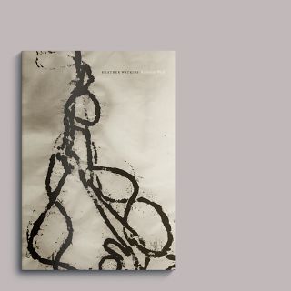
Front cover
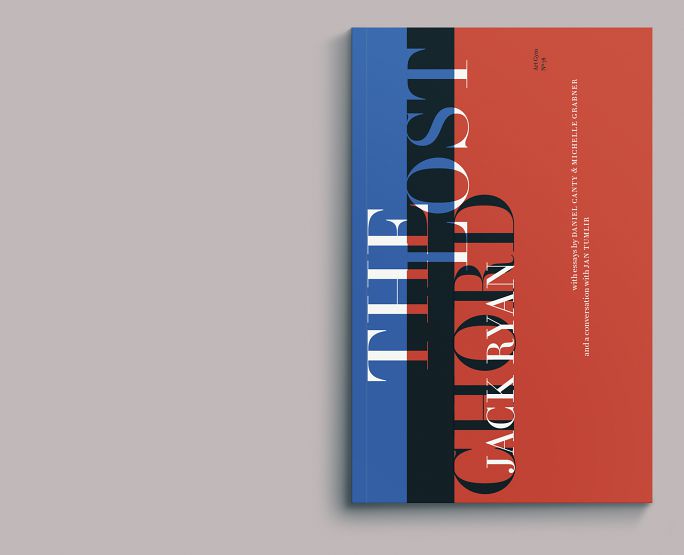
This conceit determined the book’s cover, with fields of red and blue overprinting to reveal a third color (though any two colors could have been used, Ryan uses red and blue extensively throughout his work).
Moreover, we took the intervals of Scriabin’s chord, translated them to numerical proportions, and then used those proportions to build the book’s structure. They’re all there, on the cover and throughout the text. (We wonder, on occasion, how effective this kind of deep conceptual work is. If you hadn’t read this, you likely would never know about this aspect of the book. The design process is analytical, and it is intuitive, and sometimes it is both at the same time. But in the end, perhaps it’s more about intent than outcome: setting up rules like this means we approach the text in a different way, hopefully better attuned to the content. Our friend Paul Mort makes the comparison to a painted manifold in a street rod: “You may never see it, but it’s cool.”)
2.
Frontispiece
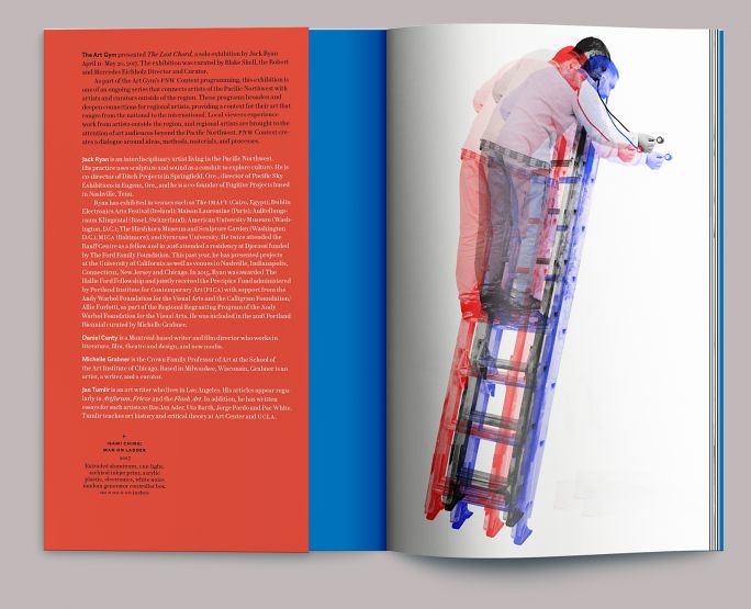
The broad fields of red and blue form the cover resolve to Ryan’s triple image of his colleague Isami Ching on a ladder, holding a stethoscope. The inside front-cover flap carries basic exhibition information and contributor bios, leaving more room inside for images.
3.
Main title
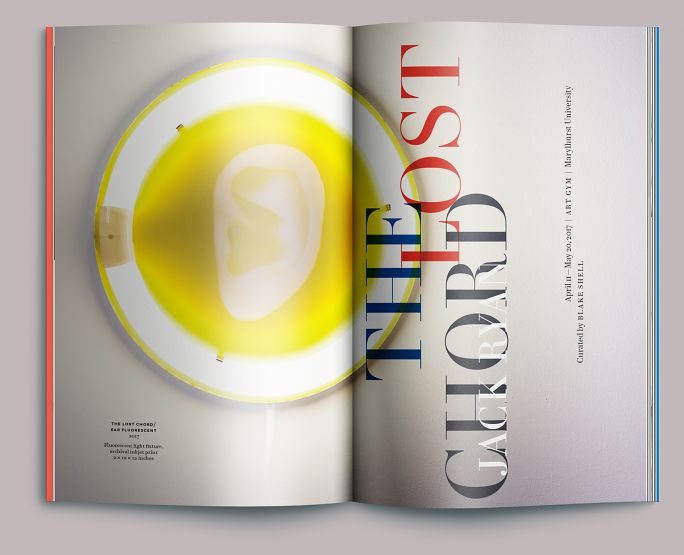
Reprise of cover type, overprinting Ryan’s wall piece The Lost Chord/Ear Fluorescent (2017).
4.
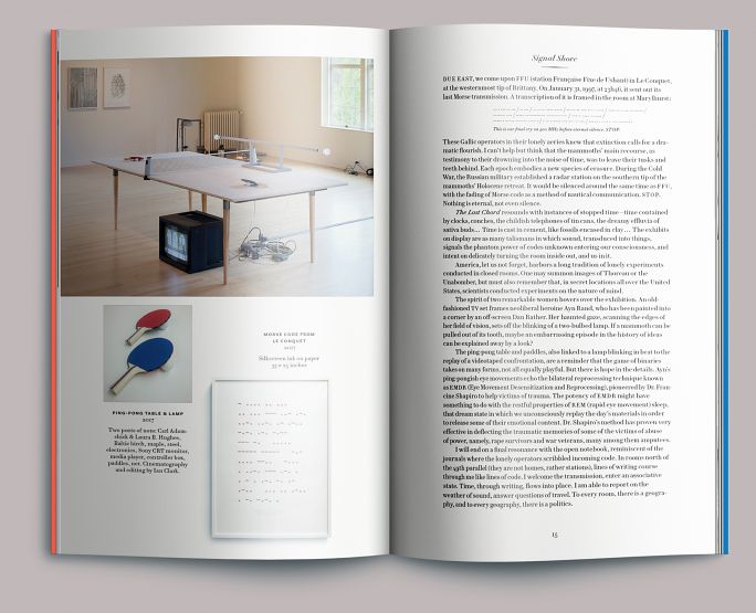
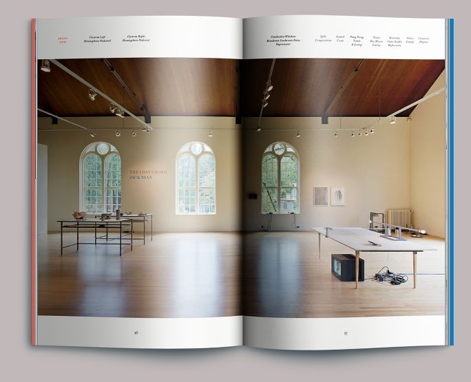
Installation view, southeast
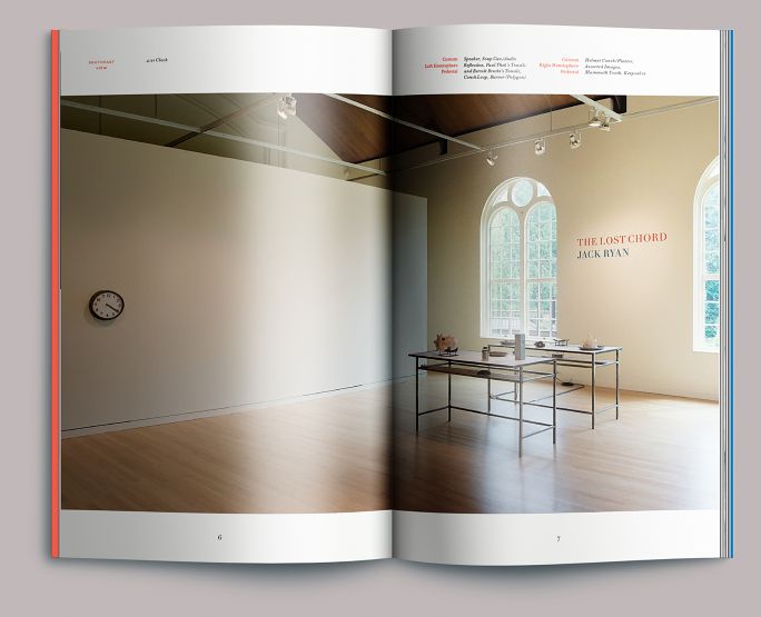
The Art Gym was configured as one large room for this exhibition. The catalog is constructed around a series of installation photographs by Evan La Londe that begin by facing east from the entrance and panning clockwise. After each installation image, we moved in to show the work framed within it in detail. Caption information runs along the top edge of the page, in approximately the same position as the labeled works.
5.
Essay opening
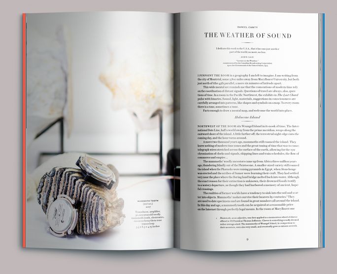
The book’s proportion and page program were structured around an image block that would partially bleed onto its facing page. To make room for this, the classically proportioned text area (constructed by Van de Graaf’s canon) is weighted away from the gutter. All objects—centerpoints for captions, page numbers, indents, etc.—are placed along the intervals of the mystic chord.
6.
Interior detail
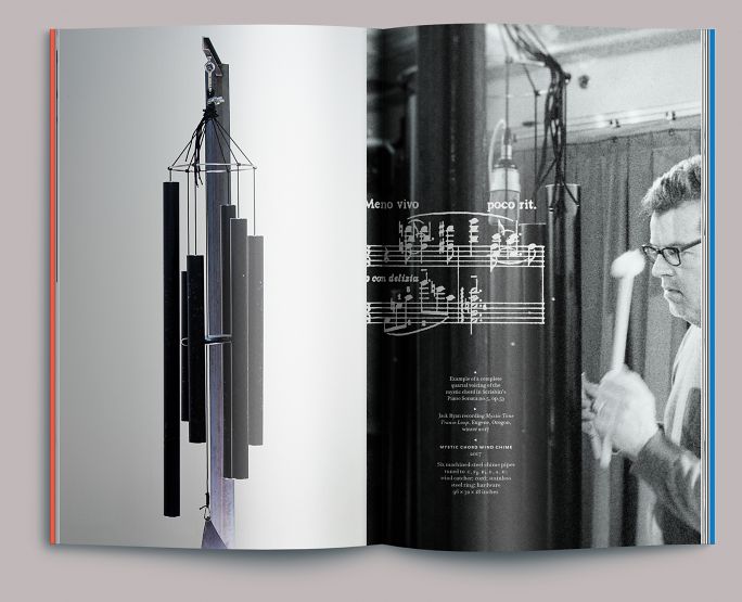
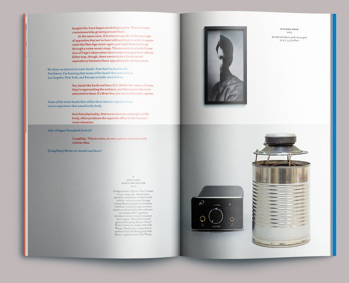
Ryan’s Mystic Chord Wind Chime, by itself, and being performed by the artist; with an excerpt from Scriabin’s Piano Sonata no. 5, op. 53, showing an example of a complete voicing of the chord.
7.
Essay interior
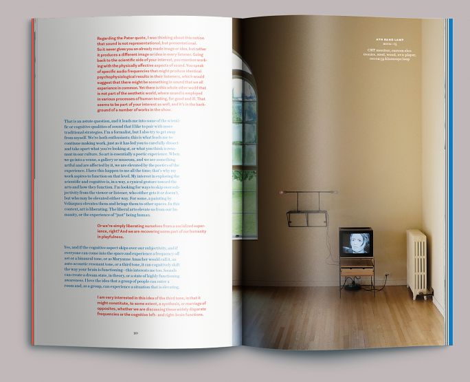
Illustrations of individual works are threaded throughout the narrative, as close as possible to their reference in the text.
8.
Installation view, south
9.
Interview opening
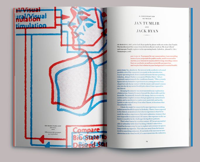
At left is a detail of Ryan’s Bio Music Flow Loop (2017). We set the artist’s conversation with critic Jan Tumlir in red and blue, both as a nod to Ryan’s work and to establish a distinct visual voice for each speaker.
10.
Interview text
Installation view of Ryan’s Ayn Rand Loop (2012–15), an illustration of the author’s furtive eye movements during a 1960s interview with Dan Rather.
11.
Interview text

Detail of Ayn Rand Loop. The uneven, staggered distribution of the image frames results from their distribution along the intervals of the mystic chord.
12.
Interview closing
End of Tumlir’s interview, showing the intrusion of the text block into an image. This is the only place in the book where that happens, and it shouldn’t work, but it does.
Colophon
48 pp. + cover
6.325 × 10 in., ed. 300
Printed in 4c digital (text), and 2-color offset (cover) on uncoated paper
Composed in Le Jeune and Questa Sans
- Essays
- Daniel Canty
Michelle Grabner - Editor
- Allison Dubinsky
- Photography
- Evan La Londe
Kathleen Murney
Jack Ryan - Printing
- Brown Printing