
Covers for Hawthorne Books
Works
- 2017
- Books / editorial
- Hawthorne Books
- Design for book covers
Every independent publisher starts out as a small press. Our goal for Hawthorne Books, whom we have served since their inception in 2001, was to get them out of the small press section as soon as possible. When we designed the cover of their first title, we kept in mind that books are not only literature, but also the foremost expressions of a publisher’s brand. That may sound cynical, but it is possible—and even desirable—for a reader to have a relationship with a press that extends beyond a particular author. Early Penguin books provide an apt example. You want a reader to think, I liked this book; and this is also a Hawthorne title, so I might like it, too.
Illustrations
1.
First principles
Up front, we devised a set of simple rules: a common page size (a bit longer than the standard 8½ inches, and in fact a golden rectangle, in homage to Tschichold’s work at Penguin) and a set of overlapping squares to serve as a guiding principle. The common page size is an economic measure: it keeps us from having to start fresh with every title. The simple grid of squares means that even though the illustrations and compositions of every book cover in Hawthorne’s catalog differ, you get a sense of family—of unity of intent—among them.
2.
Follow-through
These are trade paperbacks. They’re better-made than most—we use acid-free papers and sewn bindings—but they’re still paperbacks. We do try to include as much of the case-bound experience as possible, however: the covers have flaps, which add a bit of heft and are double-scored, so that they can be used as bookmarks. And we engage the whole cover: in the example above, the reader doesn’t even encounter the image of grass until she opens the book—a liminal moment, between holding and reading. This is part of the promise of the Hawthorne brand: we may not be big, but we can be different, more thoughtful, and hopefully better.
3.
Covers, 2002–present
-
Things I Like About America
2002

Poe Ballantine’s debut collection of essays details the author’s search for satori via a series of low-paying jobs, bus trips, and stays in residential motels. The cover is an artifact of a mid-1970s motel postcard selected for its red, white, and blue content.
-
God Clobbers Us All
2003
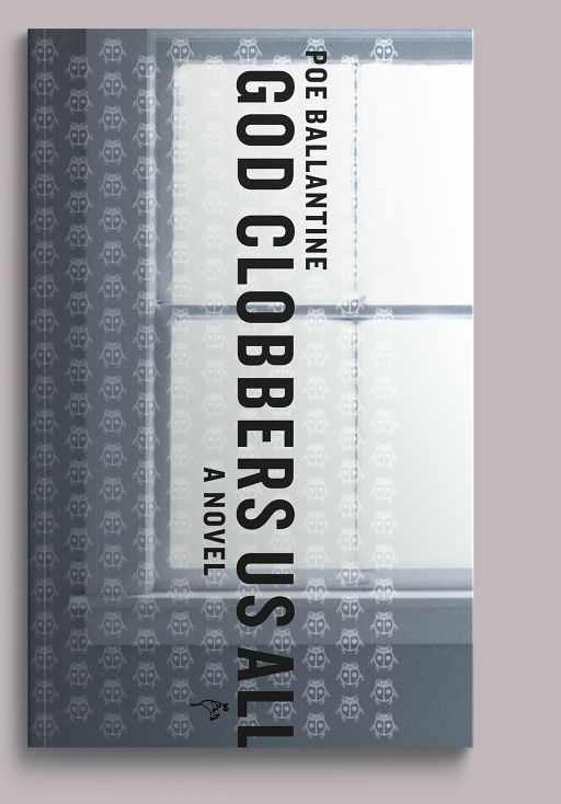
Ballantine’s debut novel, a story of teenage ennui, hard partying, and hallucinogen use in 1970s San Diego. We used an image of our kitchen window and a pattern of transparent Disneyfied ladybugs floating in the middle ground (ladybugs, real or imaginary, being a recurrent motif in the book). The ladybug pattern fades in and out of the book’s text at several transitional points.
-
So Late, So Soon
2004
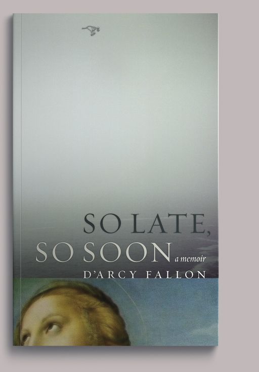
For D’Arcy Fallon’s irreverent account of her years at a fundamentalist commune on the Northern California coast, we paired an ancient postcard detail of Raphael’s Saint Catherine of Alexandria with our own image of the fog-soaked Pacific.
-
Saving Stanley
2004
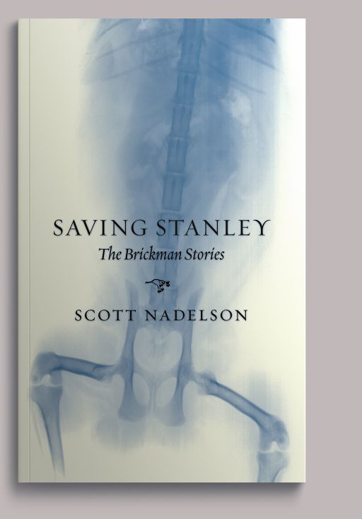
Scott Nadelson’s nuanced collection of stories documenting the world of one suburban New Jersey family won the Oregon Book Award for short fiction in 2003. The Stanley of the title is the book’s MacGuffin, an elderly cat who totters from story to story, always at the curtain between life and death. The illustration is an X-ray of our late, beloved sixteen-pound Manx, Joe.
-
Dastgah
2004
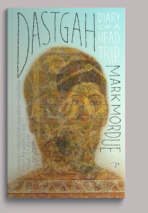
The Australian music critic Mark Mordue’s diary of his travels in Asia Minor. We layered images from our collection of Near Eastern printed ephemera into a backlit selfie.
A brief, wonkish digression: We feel that the type on a book’s cover should relate to the type inside, which is why you’ll see a somewhat restrained typographic palette throughout these covers. At this point, we had been using Hoefler & Co.’s Knockout as our sans-serif face; although the word Dastgah is hand-lettered, we wanted it to at least feel like Knockout as used in the text. It’s more or less a monoline crow-quill riff on that typeface: distorted, to be sure, but with its internal proportions maintained.
-
Core: A Romance
2005
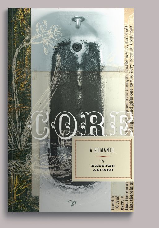
Kassten Alonso’s debut novel is a neo-Faulknerian reading of the Hades/Persephone myth (Kore, meaning “the maiden,” is another name for Persephone). We opened up our bag of Gothic tricks (Victorian Bible, engravings of dead beetles, etc.) and created an obsessive collage around a portrait of a muddy bathtub. (In the story, a bathtub stands in for the gates of the underworld; the mud you’ll have to read the book for.)
-
The Greening of Ben Brown
2005
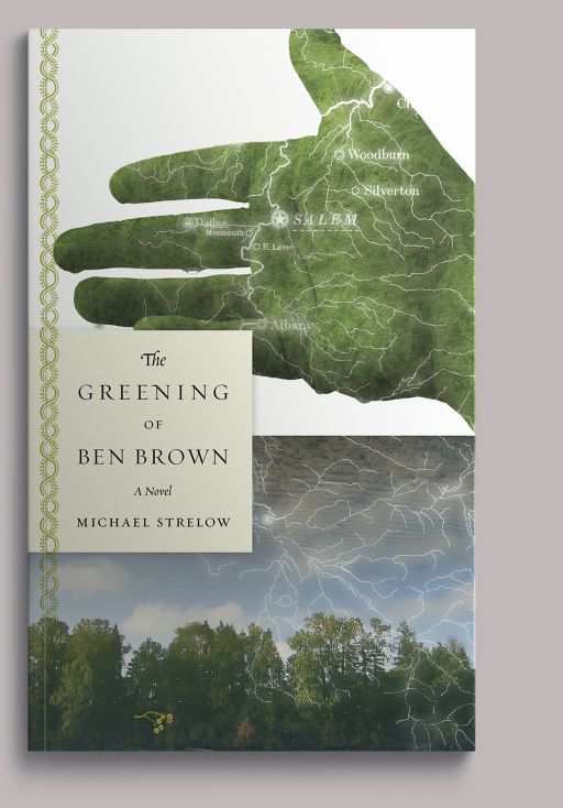
Michael Strelow’s novel concerns a struggle over the health of a river, a struggle between a chemical company and a utility lineman-cum-ecowarrior who has been turned green by accidental electrocution. That’s our hand, and our landscape of the middle Willamette River, where the story takes place. By happy accident, a drawing of the Willamette watershed left over from another job tied the two images together and stood in for the lightning that transformed the hero.
-
Madison House
2006
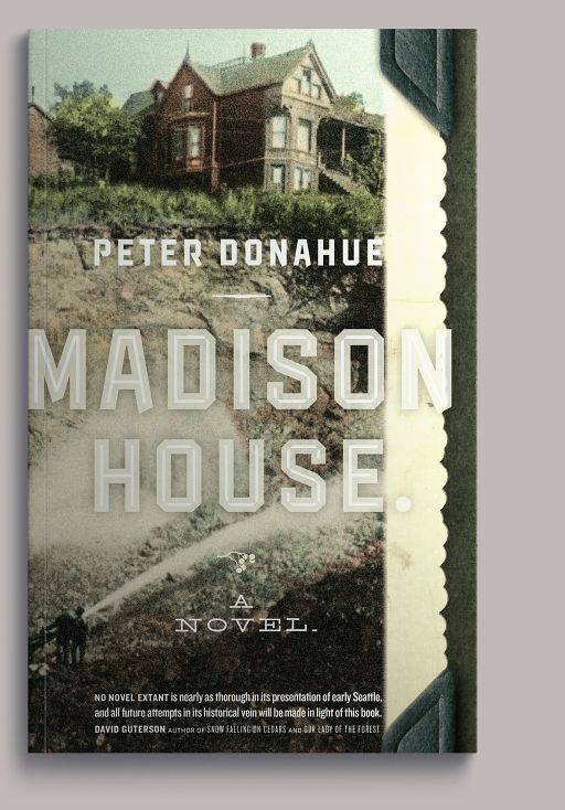
Peter Donahue’s Madison House is a historical novel dealing with the controversial regrading of Victorian Seattle. In a miracle of the internet, eBay delivered a postcard showing the regrading (that is, the leveling with a water cannon) of the self-same hill that forms the novel’s context. Type nerds, please note: the lettering is a Victorianized version of Hoefler & Co.’s Knockout (see Dastgah).
-
The Cantor’s Daughter
2006
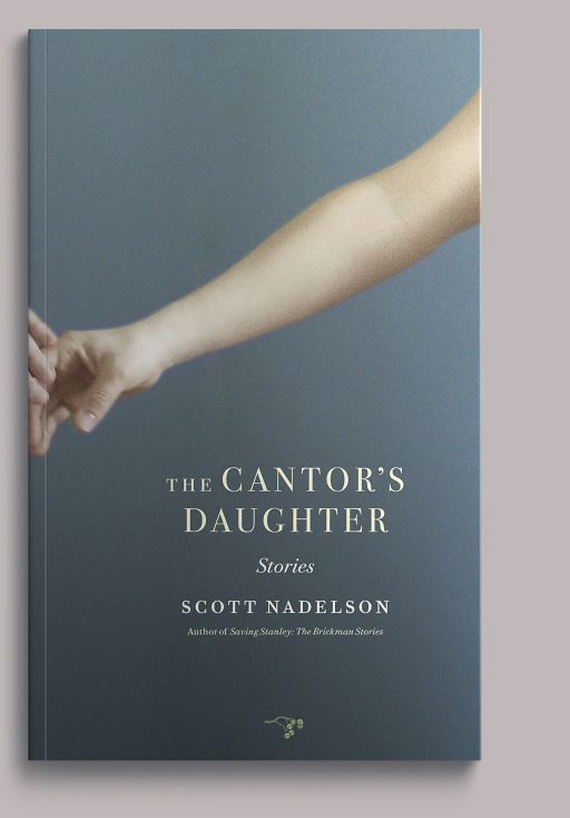
Scott Nadelson’s second collection examines the moments of critical—though not outwardly dramatic—transition that occur in men’s and women’s lives. Nadelson’s stories are largely interiors, and they are jewel-like in their construction and attention to detail. Reading them, we kept thinking about the quality of light and narrative ambiguity in the paintings of Johannes Vermeer. You can’t tell if the girl in Girl with a Pearl Earring is glancing toward you or turning away; we wanted to achieve a similar effect here.
-
Soldiers in Hiding
2006
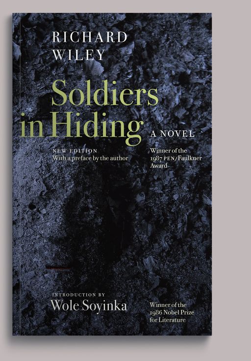
In 2006, Hawthorne began republishing celebrated out-of-print modern titles under its Rediscovery imprint. The inaugural title was Richard Wiley’s PEN/Faulkner winner Soldiers in Hiding, which tells the story of American-born Japanese conscripted into the Japanese Imperial Army during World War II, and examines what became of them in the years following the war.
-
Decline of the Lawrence Welk Empire
2006
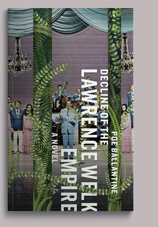
Illustrator Mark Conahan re-created Rousseau’s jungle on Lawrence Welk’s sound stage for Poe Ballantine’s second novel, which follows the antihero of God Clobbers Us All into the Caribbean wild in search of the noble savage.
-
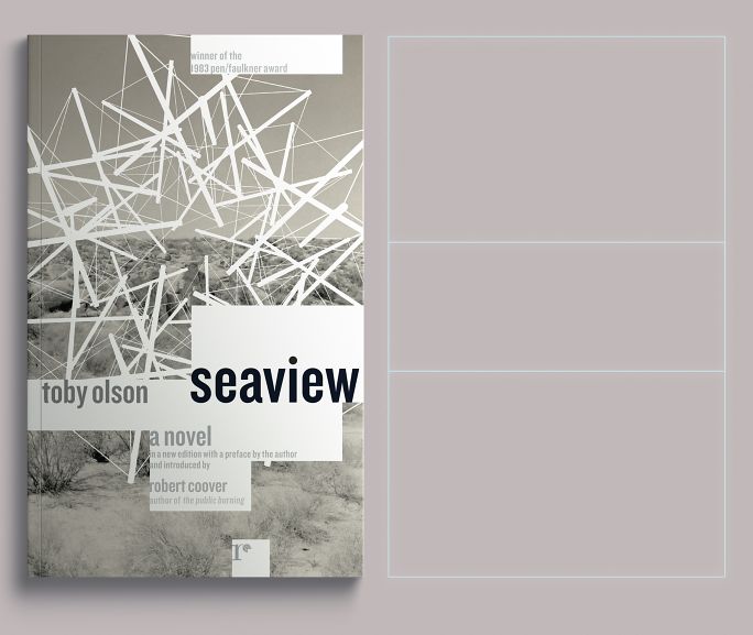
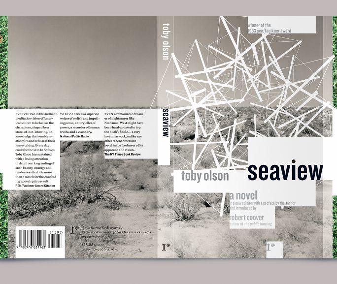
Seaview
2007
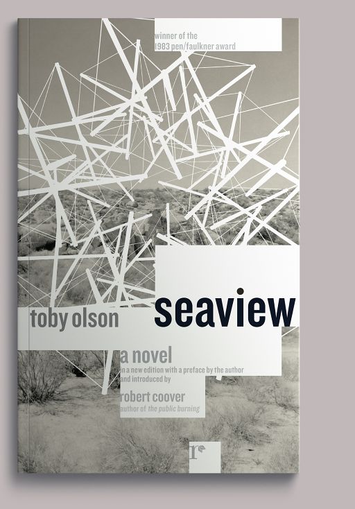
Published under the Rediscovery imprint, Toby Olson’s PEN/Faulkner winning Seaview follows a golf hustler across the American desert as he tries to return his dying wife to her childhood home on Cape Cod. The story also involves the cocaine trade, a Pima Indian activist named Bob White, and the abiding presence of Buckminster Fuller’s tensegrity sphere, ably illustrated for the cover by Mark Conahan.
-
Clown Girl
2007
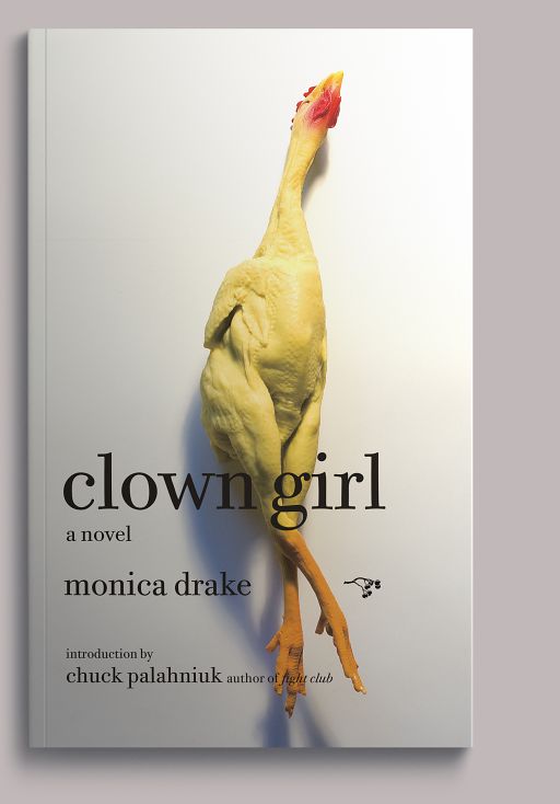
The title of Monica Drake’s celebrated novel is neither ironic nor metaphorical. This book is about clowns and the people who love—and fear—them. Production note/miracle of the internet: it’s now easy to find a rubber chicken when you want one.
-
501 Minutes to Christ
2007

A second collection of essays from Poe Ballantine, picking up where Things I Like about America left off. The illustration features an artifact from an old Seventh-day Adventist pamphlet, blown up to show the dot pattern: a visual reference to the cover of Ballantine’s first book.
-
Leaving Brooklyn
2007
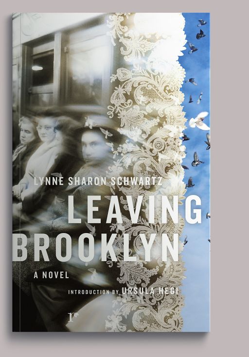
The third book in Hawthorne’s Rediscovery series was Lynne Sharon Schwartz’s novel Leaving Brooklyn, about a young woman’s coming-of-age and erotic awakening during the McCarthy era. The author hated this cover. This doesn’t happen often, but it does happen.
-
Faraway Places
2008
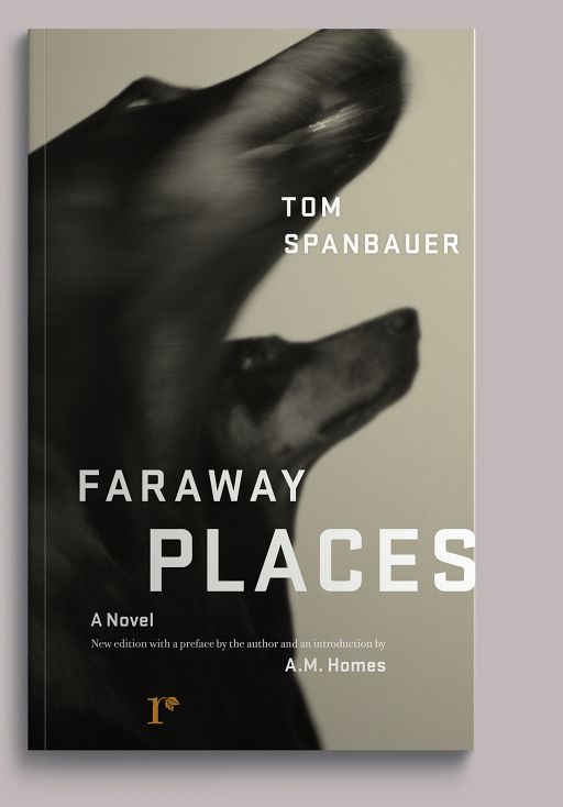
A Rediscovery printing of Tom Spanbauer’s elegant, harrowing debut, evidence that the South cannot claim exclusive rights to the Gothic, whose darkness holds equal sway in rural Idaho.
This book also marked our departure from doing everything in-house: Hawthorne was starting to make a little more money, and so we had some room in the budget for image research and purchase, which is kind of a mixed blessing: we didn’t have to spend as much of our budgeted time scrambling to assemble something from nothing, but the process became more about finding a good fit, rather than making something new. It shows in many of the subsequent titles, which, while perfectly fine, just aren’t as weird as the covers from the first six years.
-
The Well and the Mine
2008
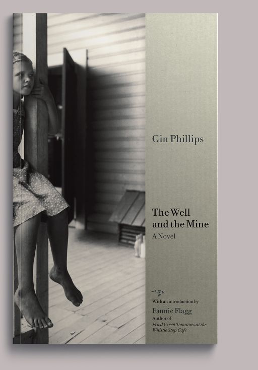
Hawthorne published the debut of Southern author Gin Phillips, whose rich tale of an Alabama coal-mining town during the Depression returned superb reviews. The “paperback rights” (an odd term, as the first edition was technically a paperback) were subsequently snapped up by Penguin. The cover features a photograph by Eudora Welty, another Southern author you may be familiar with.
-
The Tsar’s Dwarf
2008
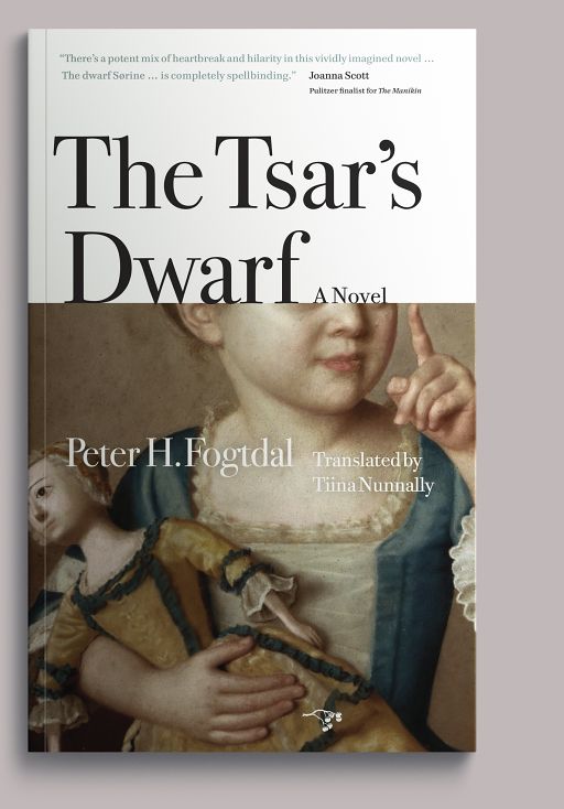
Tiina Nunnally’s translation of the Danish novelist Peter H. Fogtdal’s The Tsar’s Dwarf is a dark historical-political romance about those in the periphery of courtly life during Peter the Great’s reign, as seen through the eyes of a female dwarf attached to his court.
-
Autobiography of a Recovering Skinhead
2010

A brutal, clear-eyed account of a young man’s descent into hatred and violence, his rise through the ranks of the white supremacist movement, and his ultimate redemption. That’s the author shown on the cover, before he had his tattoos removed.
-
Little Green
2011
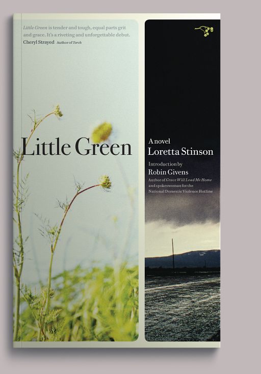
Loretta Stinson’s bildungsroman follows a sixteen-year-old runaway as she negotiates love, betrayal, violence, and transcendence along the nooks and eddies of the I-5 corridor in the 1970s.
-
The Chronology of Water
2011

Nudity! And it’s the author! This one had to ship with a bellyband to appease more family-oriented booksellers, yet the cover pales next to what’s inside: a dark, unsparing memoir of drug use, sexual adventure, and questionable impulse control during author Lidia Yuknavitch’s youth as a competitive swimmer.
-
Aftermath
2011
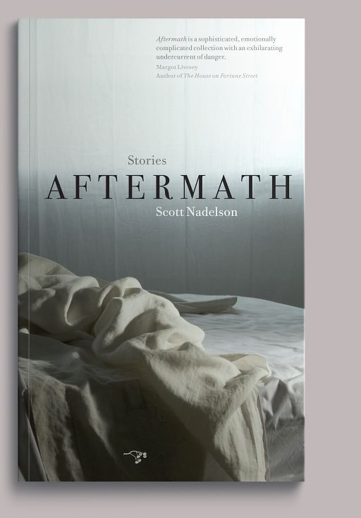
Scott Nadelson’s third collection of stories continues to plumb the existential depths of New Jersey suburbanites, particularly in regard to the rewards and risks of intimacy.
-
The Luminist
2011
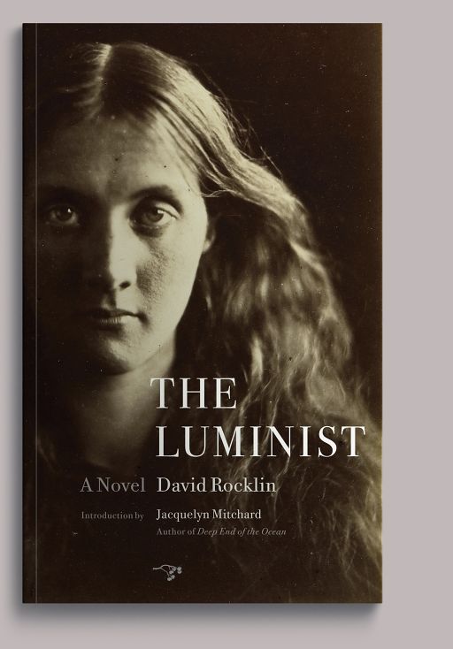
David Rocklin’s debut novel is set during the revolution in colonial Ceylon and is loosely based on the life of photography pioneer Julia Margaret Cameron, whose portrait of her niece (who would become Virginia Woolf’s mother) is on the cover. In a rare moment of serendipity, this photograph turned out to be the very one that inspired Rocklin to write the book.
-
Dora: A Headcase
2012
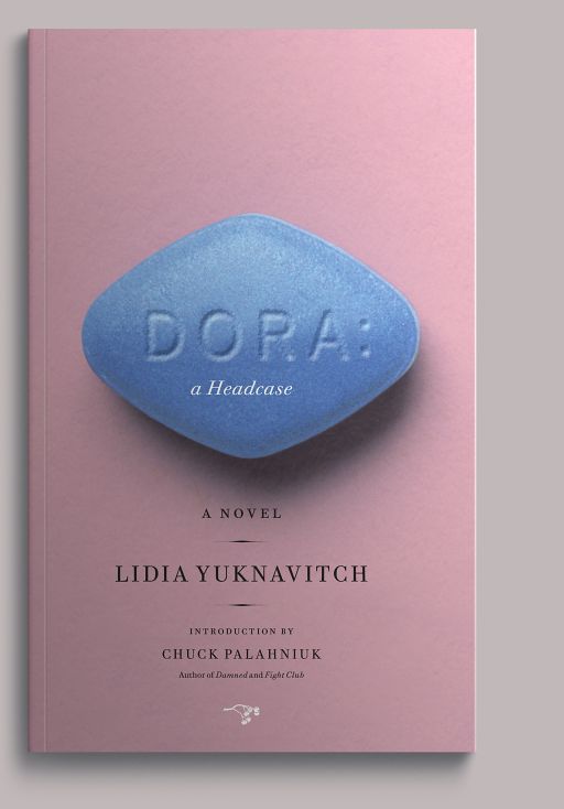
Viagra serves as Chekhov’s gun in this riff by Lidia Yuknavitch on Freud’s famous case study of female sexuality; the eponymous protagonist could also be described as a bit of a pill.
-
The Next Scott Nadelson
2013
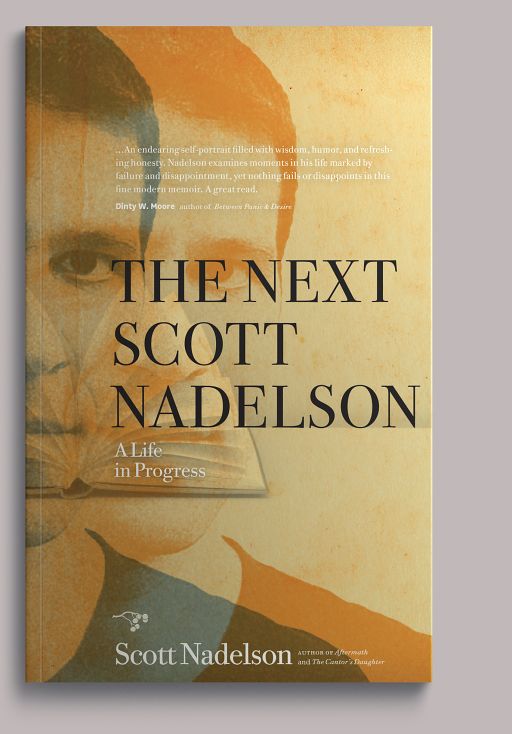
The accomplished short-story writer gets jilted at the altar—his fiancée leaves him for a drag king—and uses the experience to turn his remarkable powers of observation on himself during his subsequent period of reinvention.
-
Wedlocked
2013
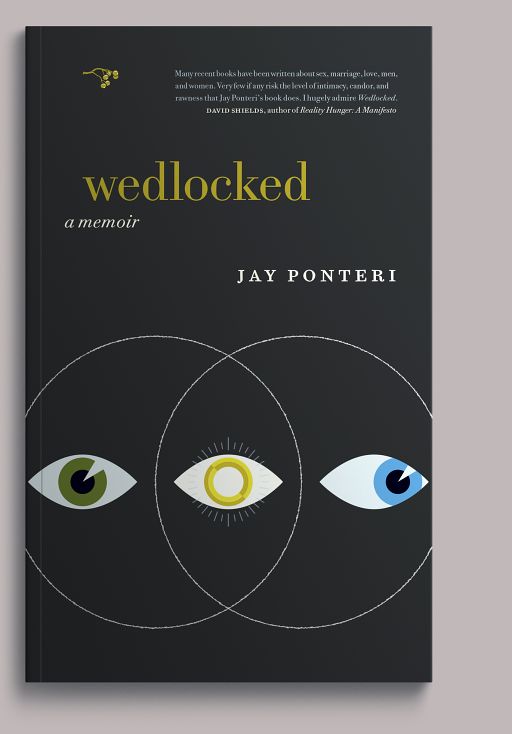
Jay Ponteri wrote this memoir to investigate and understand the conflict between his identity as a faithful husband and his inner life, which calls him to another woman.
-
Brilliance
2013
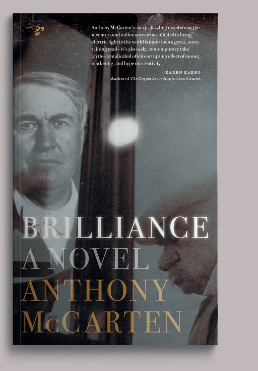
Celebrated screenwriter Anthony McCarten uses the story of the unlikely relationship between inventor Thomas Edison and financier J.P. Morgan to explore the nature of intelligence, the forms it can take, and the ways it can corrupt or transcend. That’s Morgan at lower right; and, yes, his nose did look like that.
-
Love & Terror on the Howling Plains of Nowhere
2013
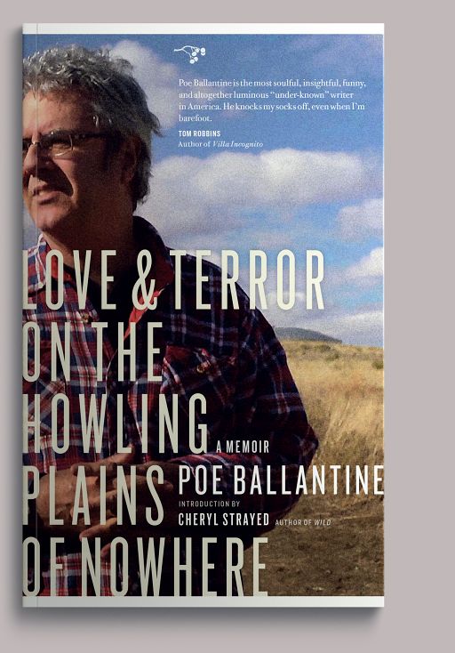
Part true crime, part confessional, Love & Terror is an inquiry into an unsolved murder in Poe Ballantine’s tiny Nebraska hometown and an open-handed examination of his rocky marriage.
-
The End of Eve
2014
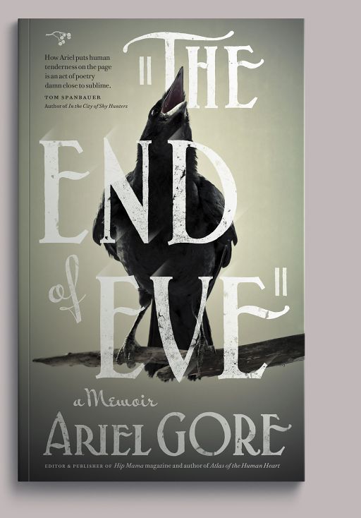
A dark, funny account of the final days of Ariel Gore’s heroically narcissistic, film noir–obsessed mother. Cover lettering is adapted from the main titles of The Maltese Falcon, her mother’s favorite film.
-
I Loved You More
2014
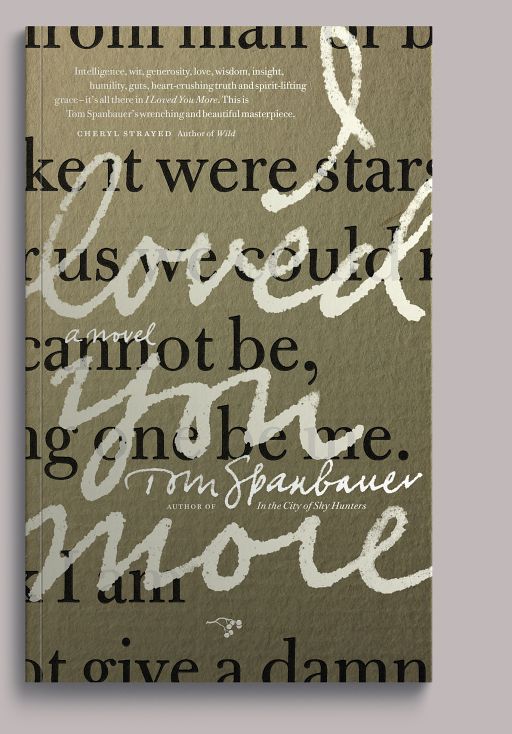
Tom Spanbauer’s fifth novel examines eros and agape across a thirty-year friendship. The title comes from Auden’s poem “The More Loving One,” a detail of which reads behind the title.
-
The Mary Smokes Boys
2014
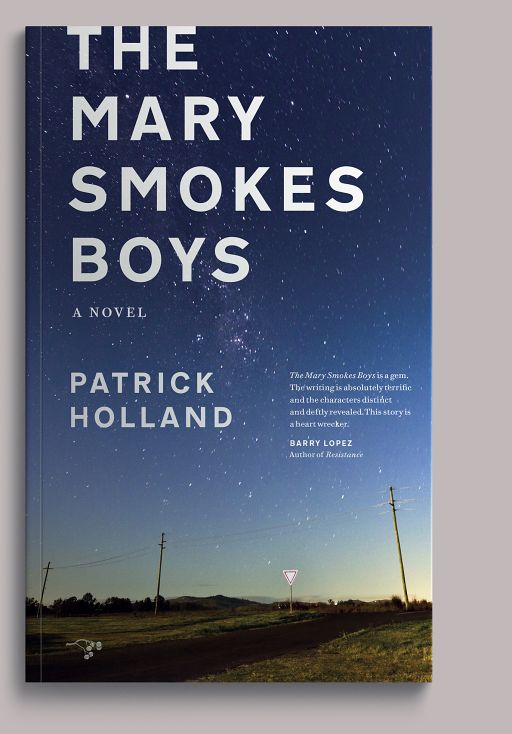
Set in rural Queensland, Australia, Patrick Holland’s novel is a rich meditation on fraternal love and responsibility, and about how our relationship to landscape can define us. The cover image is the Australian night sky, and was taken in the book’s neighborhood.
A digression: Many writers treat landscape as character, and characters are specific. They are not interchangeable. There are a handful of covers here showing land, and without exception it is the general place (within a hundred miles, say) of the landscape referenced by the author. It may be that if we didn’t do this, no one would ever know. But we would know. If we hadn’t been able to find a Queensland sky for The Mary Smokes Boys—a lucky break—we would have done something else entirely.
-
Food Lover’s Guide to Portland
2014
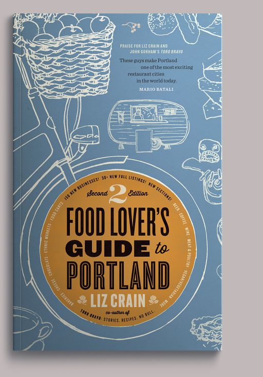
The second edition of the Portland food writer Liz Crain’s lively guide—not just to restaurants and food carts, but also to the raw materials that feed their kitchens, and yours. Our friend Mark Conahan illustrated the various charms of the Portland food milieu for the cover.
-
The Diamond Lane
2014

Karen Karbo’s second novel, originally published in the mid-1980s and offered in a completely new edition by Hawthorne in 2014, is a comic romance of art, commerce, and Hollywood during its transition from studio system to marketing machine. The ecosystem of pre-digital film production permeates the text, though we have since wondered whether younger readers will even know what the cloverleaf in the cover illustration is made of.
-
Call Me Home
2015
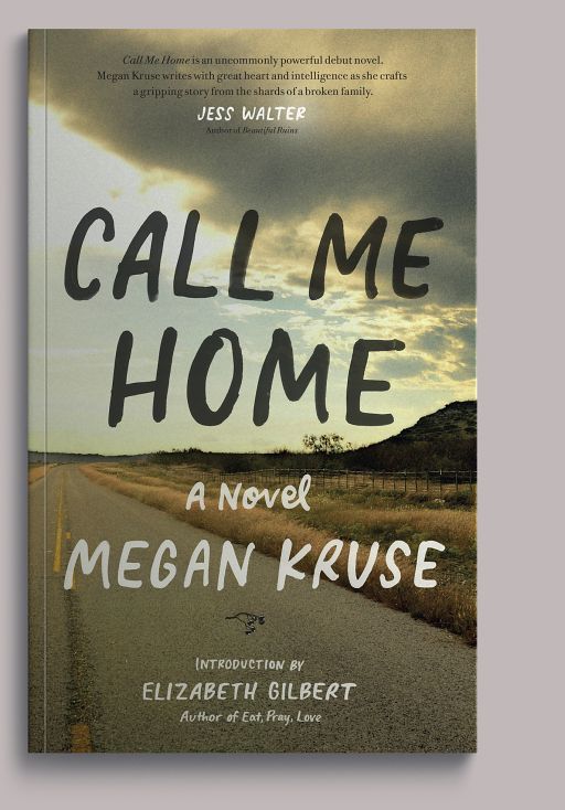
Megan Kruse’s debut novel is a gripping story of escape, self-discovery, and transcendence set in the Pacific Northwest and the Hill Country of Texas. Cover lettering by Mia Nolting; road image (a conceit we have perhaps used too often) of the Hill Country (about which see commentary on The Mary Smokes Boys, above).
-
Life is Short—Art is Shorter
2015
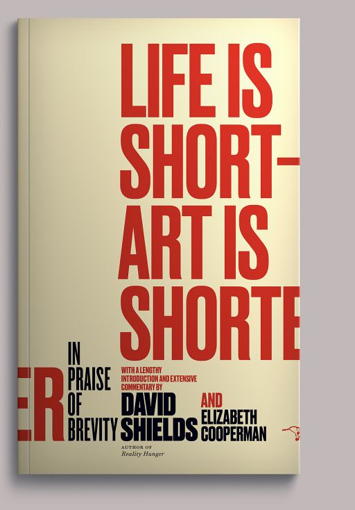
David Shields and Elizabeth Cooperman compiled and annotated this paean to brevity and concision—in writing, and in life. Another lucky break: Commercial Type’s Druk, drawn by Berton Hasebe, had just been released when we were working on this: there are other compacted gothics, but Druk is unsurpassed in its ratio of legibility to ink-hogging.
-
White Matter
2015

Janet Sternburg’s memoir is also a deep and personal dive into the history of prefrontal lobotomy as expressed through the experience of her brother and sister, each of whom had one. That’s her brother at left.
-
Violation
2016
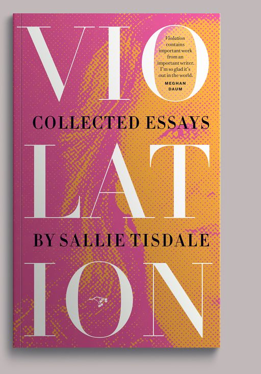
The first published collection of the essayist Sallie Tisdale’s work, spanning thirty years of difficult and meticulous inquiry. Ms. Tisdale hated this cover. (See Leaving Brooklyn, above.)
-
The Inventors
2016
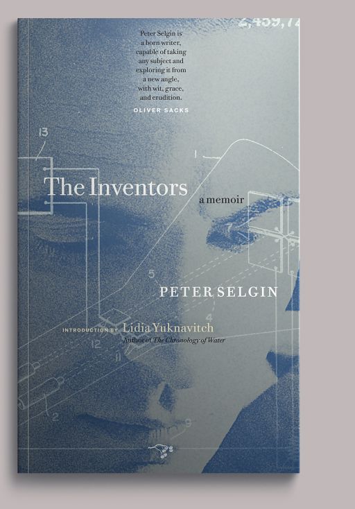
Peter Selgin’s memoir examines his growth through the lens of his ambiguous relationships with two men—his father, an accomplished inventor; and his eighth-grade English teacher. This was a rare case of the author’s headshot making it onto the cover. His father’s drawings were readily available through the US patent office.
-
Girl Trouble
2016
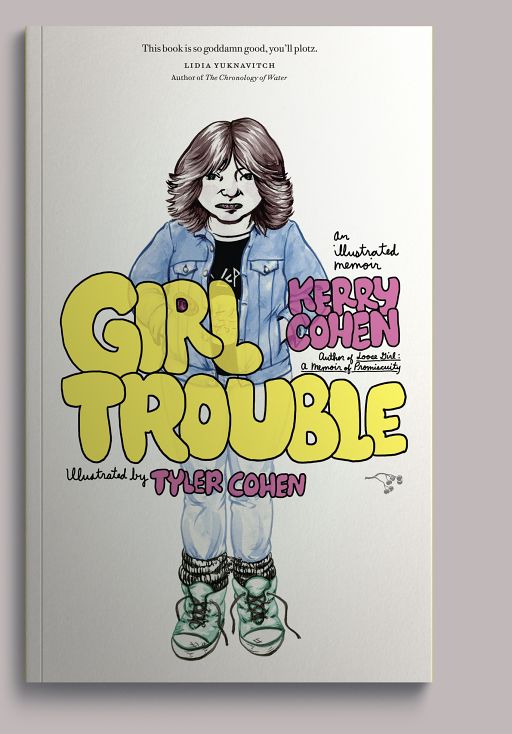
Kerry Cohen’s memoir is a taxonomy and exploration of female friendships, illustrated by her sister Tyler. Bespoke teenage bubble lettering by Mia Nolting.
-
Motherhood Made a Man Out of Me
2017
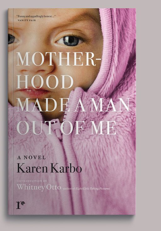
A Rediscovery edition of Karen Karbo’s third novel, a darkly comic appraisal of new parenthood.
-
Narrow River, Wide Sky
2017
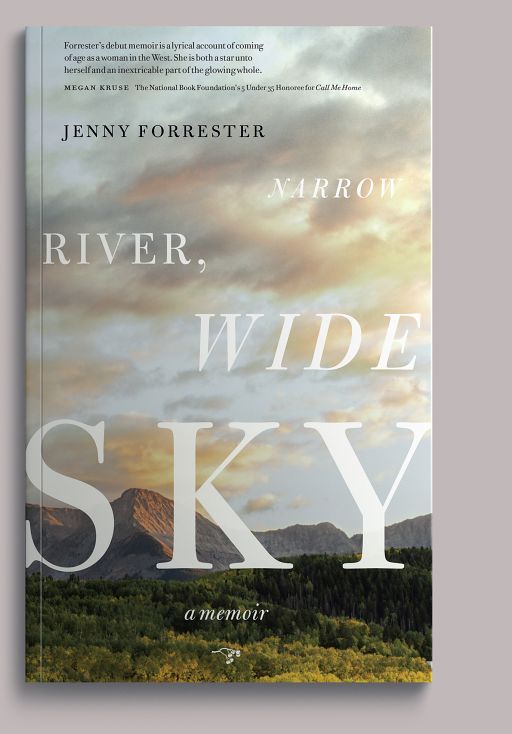
Jenny Forrester’s debut, a wide-ranging account of the her upbringing on the Colorado Plateau, is part memoir, part meditation on the mythology of family.
-
California Calling
2018
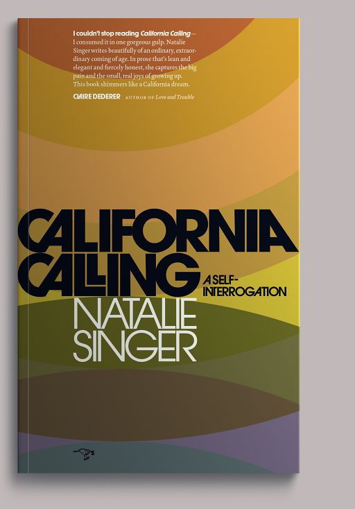
Natalie Singer refers to California Calling as a “self-interrogation” rather than a memoir, and though the text does relate her emigration from Canada and subsequent settlement in California during the early 1980s, it spends at least as much time evaluating its author’s decisions as it does illustrating them. Colors here are the actual hues popular in kitchen appliances of the day: Harvest Gold, Rush, Avocado, and Corsair (a like-minded soul on the internet had gone to the trouble of finding and/or measuring their CMYK equivalents).
-
Whirlaway
2018
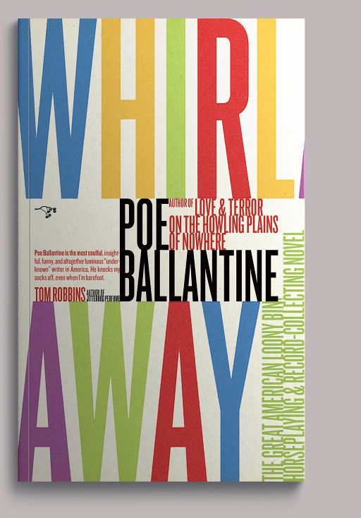
Poe Ballantine’s third novel under the Hawthorne imprint, a comic muddling of racetracks, mental institutions, swap meets, and the San Diego coast.