Tannaz Farsi: The Points of Departure
Works
- 2017
- Books / editorial
- Linfield College
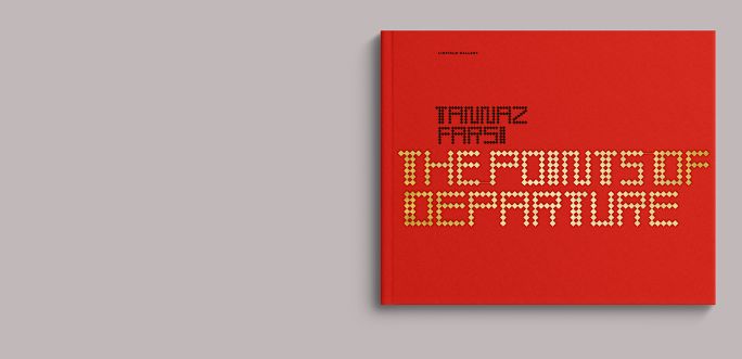
- Tannaz Farsi: The Points of Departure
A monograph produced to accompany an exhibition of the work of Iranian American artist Tannaz Farsi, curated by Josephine Zarkovich and held at Linfield Gallery in 2017.
Born in Iran, Farsi makes disarmingly elegant and demanding work that examines memory, erasure, and the aftermath of colonialism. Though many of her references are drawn from the Middle East (gold leaf; red tulips; a wall of text listing major Iranian feminist figures using a typeface of Farsi’s own device based on principles of Islamic calligraphy; and so on), the result is familiar for anyone with experience in authoritarian and patriarchal cultures.
She is not intrinsically a gallery artist. This work is experiential, and it is the work of this book to present those experiences.
Some basic principles: Essay and image are presented simultaneously, so the reader doesn’t have to flip back and forth. If a work is referenced in the text, the corresponding image should be as close to the reference as possible. Works not explicitly referenced in an essay are gathered in the later part of the book.
The Points of Departure presents in landscape format, for reasons both practical and thematic. Most of the documentation is horizontal, but the work itself reads as interior landscapes, which can’t be contained in a single image. The pages of the book must walk the reader around the work over several images. A panoramic format suits this approach. The finish size of the book as shown is 11 × 9 inches, giving an overall proportion of approximately 1:1.2, or a half octagon.
Illustrations
1.
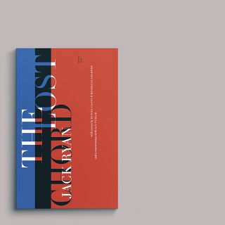
Cover
The book is case-bound in red cloth, and the cover is stamped in matte black and metallic gold foil. The letterforms were created by Farsi for her work The Names and are based on geometric Kufic script suited to architectural tiling.
2.
Frontispiece
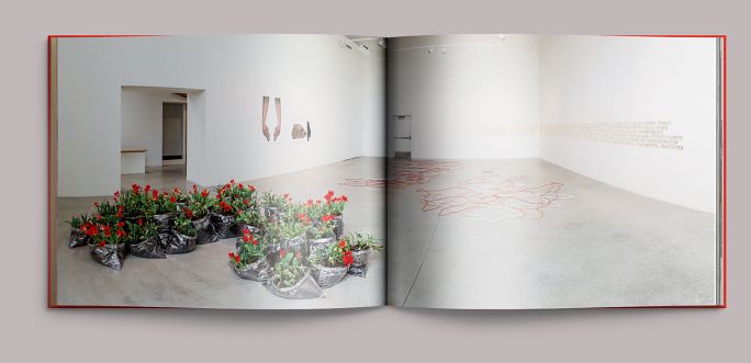
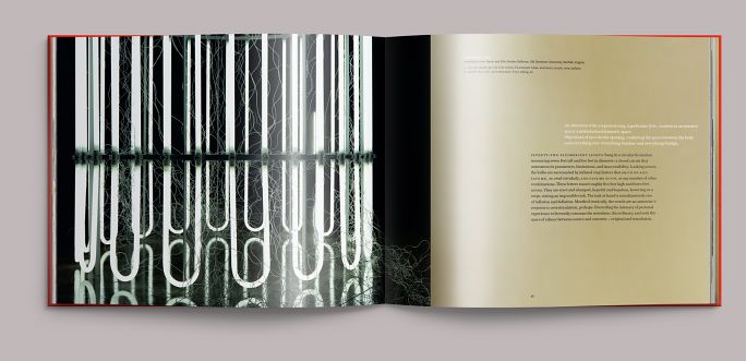
Photographer Mario Gallucci’s panoramic image fans out the Linfield Gallery, showing the entire exhibition in one view.
3.
Full title
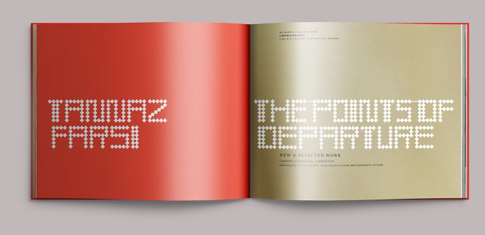
The book’s principal colors are red and gold: red from the tulips of Farsi’s Units of Moveable Earth and gold from The Names, though both colors show up regularly in her other work as well.
4.
Contents
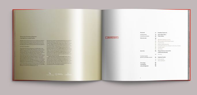
The first half of The Points of Departure concerns the work shown at Linfield Gallery, examined in two essays, one by cultural theorist Anne-Marie Oliver and one by the Los Angeles–based curator Trinie Dalton. The second half provides a broader look at Farsi’s work from 2009 to the present, anchored by Stephanie Snyder’s essay on Farsi’s environmental work Territory.
5.
Detail
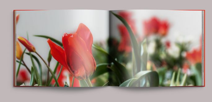
Farsi’s work Units of Moveable Earth consists of one thousand species tulips—an Iranian symbol of martyrdom and an emblem of the country itself since the 1979 revolution—planted in vinyl sacks and timed to bloom at the spring equinox and Persian New Year.
6.
Essay opening
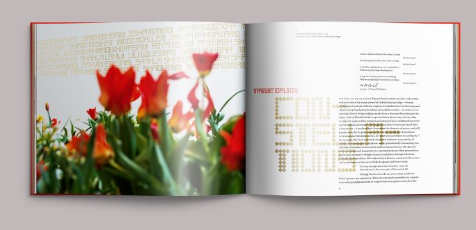
We rationalized the letterforms Farsi developed for her work The Names—scaling them so that the rhomboids aligned with the text leading—and with her permission deployed them as the display typeface, pairing them with Questa, a recent Dutch creole of French Modern types. The nineteenth-century Didones upon which Questa is based were derived from geometry, rather than Renaissance writing models; this particular low-country remix does a good job of bringing some warmth—although little sentiment—into its forms.
7.
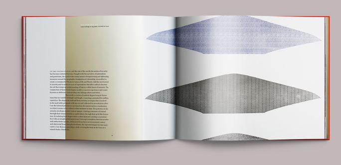
Essay interior
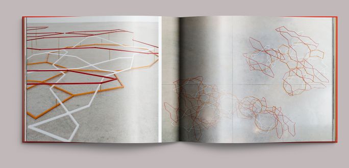
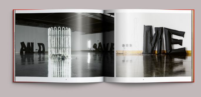
Views of Farsi’s sculpture #28, Topkapi Scroll (2017), a three-dimensional translation of a fifteenth-century Islamic architectural arabesque. It can be difficult to get a sense of an installation in one image, so we tend to rely on carefully paced sequences to move the reader’s eye around, as if the book were a very slow film.
8.
Endnotes & transition
That sense of movement should be evident throughout the book. Here, the endnotes for Dalton’s essay overlap a large field of metallic gold, signifying the transition into the book’s second half and creating a figure/ground relationship where the section divider appears to be sliding left.
9.
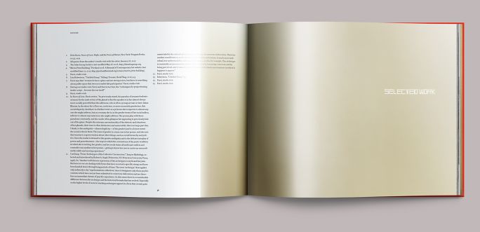
Selected work
The gold field recurs throughout the second half of the book. It is used to house Farsi’s notes on each work and to mark the transition from one piece to the next.
10.
Selected work, continued
Opening detail view of Farsi’s 2009 installation ECHOMAKER.
11.
Selected work, continued
Subsequent sequence views from ECHOMAKER.
12.
Selected work, continued
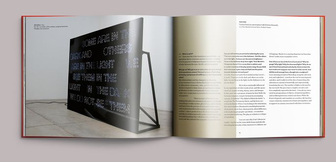
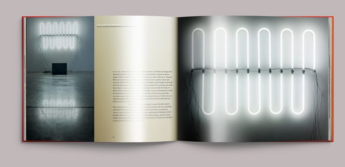
The artist’s conversation with curator Kristan Kennedy is concerned mainly with the work shown, the programmed LED panel And others (2015), but is different from other types of information in the book. Accordingly, it is set in three columns, only partially overlapping the gold field.
13.
Selected work, continued
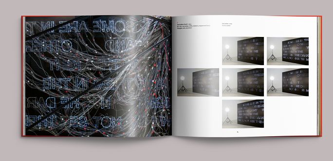
Wiring detail and sequence view of And others (2015).
14.
Selected work, continued
Detail view of Point and Line (2016).
15.
Selected work, continued
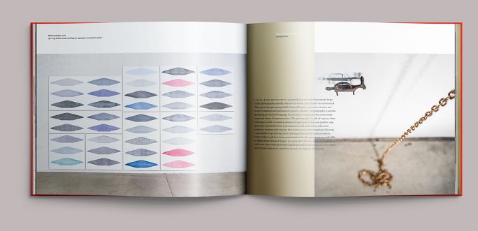
Master view of Point and Line, transitioning to Strata of Empire (2016–). The Points of Departure is only eighty-four pages long, so it was not practical—and would have been boring—to contain each work in discrete spreads. Overlapping image with type was fine, so long as the type was readable and did not obscure important parts of the image.
16.
Selected work, continued
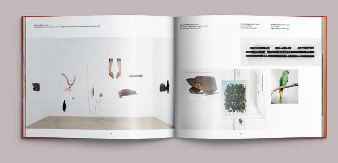
Master and detail views of Strata of Empire (2016–). Throughout the book, works were captioned along the top of the page, captions aligned with the left side of the image referenced.
17.
Chronology
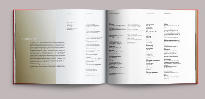
Treatment of the artist’s abridged CV and a brief statement.
Colophon
84 pp. + cover
11 × 9 in., ed. 1,000
Printed in six colors (4c + 2 match) on coated matte paper
Sewn and bound in cloth
Composed in Questa and Questa Sans
- Essays
- Trinie Dalton
Anne-Marie Oliver
Stephanie Snyder - Editor
- Allison Dubinsky
- Photography
- Mario Gallucci
Jonathan Bagby
Farhad Barham
Chris Burnside
Shane Butler
Tannaz Farsi
Mark Stein
Gillian Wilson
Carson Zullinger - Printing
- Print Vision