Disjecta: Curator in Residence 7 catalogue
Works
- 2018
- Books / editorial
- Disjecta Contemporary Arts Center
- Curator in Residence 7: Julia Greenway
A thoroughly documented review of curator Julia Greenway’s tenure as Disjecta Contemporary Arts Center’s 2017–18 curator in residence, this is also the first major publication produced under communications standards we helped develop for Disjecta’s executive director, Blake Shell.
Conceptually, Greenway’s curatorial practice is concerned with issues of gender, economics, and environment as processed through digital media. Visually, the work she presents tends to be hard-edged, strongly colored, confrontational, and attuned to the ephemeral and slightly seedy nature of digital communication.
The book’s basic form is defined by the restrained, ranged-left typography of Disjecta’s brand language and the architecture of the gallery guides produced for each of the four shows curated by Greenway. It is in itself a digital product: while the cover is traditional offset, the text was printed using a direct-from-RGB workflow to the Komori IS29 digital press, helping to preserve the high-chroma colors of the exhibited artwork.
Illustrations
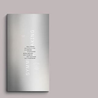
1.
Front cover
The motif of overlapping squares comes from the scheme we developed for the season’s wall graphics; it is rendered here in matte black on chrome-surfaced paper. As new, the surface is very hard and impassive. Given time and use, both the ink and the paper will scuff, showing wear and decay in a way that the digital work it represents will not.
2.
Frontispiece
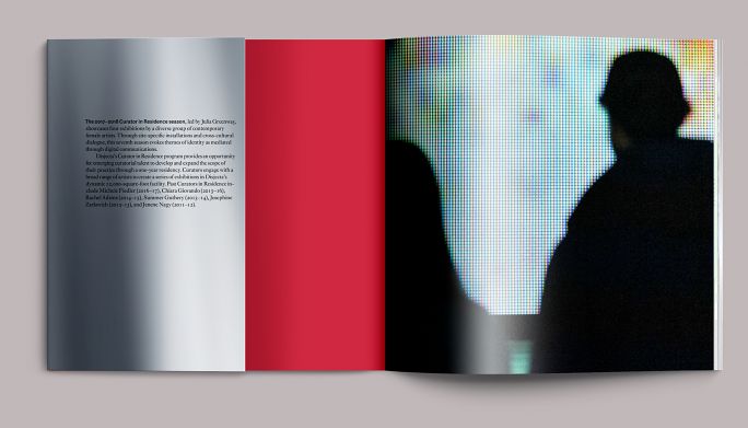
The text is bound in wraps, with the inside front cover painted in red. (Only the exterior has a chrome surface.) The frontispiece is an image from the opening of Sarah Meyohas’s Cloud of Petals: visitors silhouetted against the work’s digital matrix.
3.
Half-title
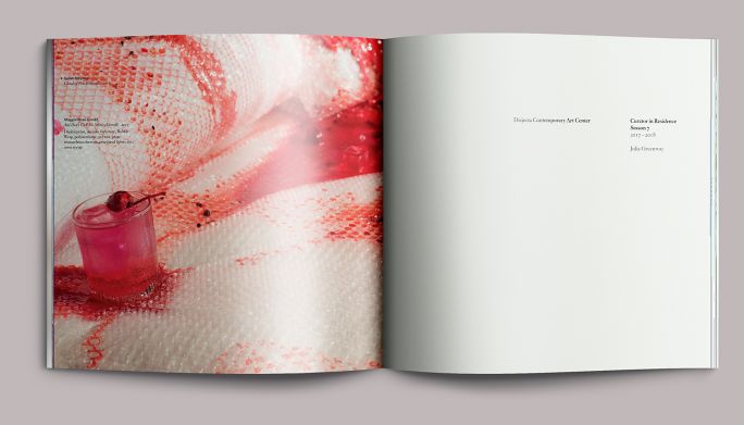
A detail from Maggie-Rose Condit’s installation And Don’t Call Me Shirley set against a spare, restrained half-title treatment. The visual tool kit we developed for Disjecta’s brand is meant to be—as much as anything can be—a neutral frame. That is not to say it should be dull—there is room for dynamic presentation, as you’ll see below—but the organization’s voice should be more about emphasis and less about tone.
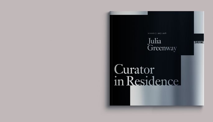
4.
Full title
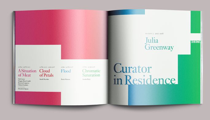
Here, the black forms from the cover reprise, but they are flipped white against a spectrum of the season’s key colors. A recap of the season is at left.
5.
Contents
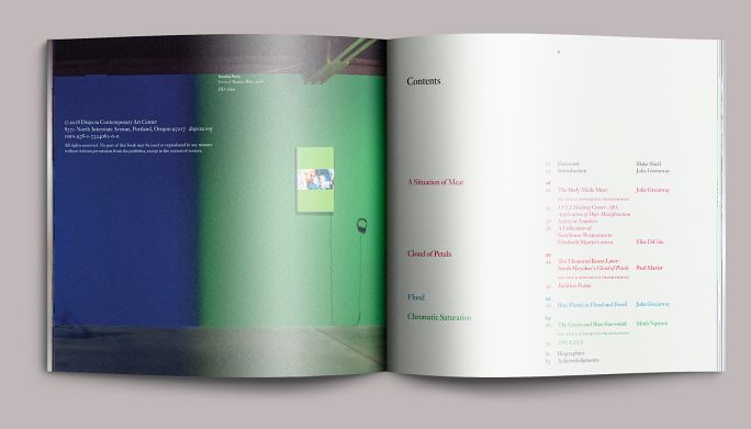
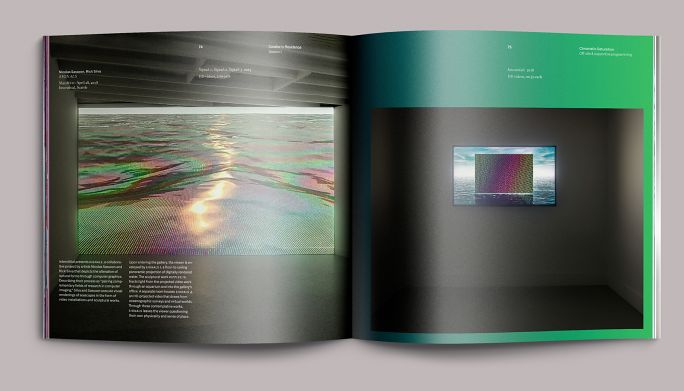
The table of contents, illustrated with a view of Sondra Perry’s exhibit Chromatic Saturation. One of the characteristics of the digital press we used is that it doesn’t print with a traditional process rosette, so printing small text type as a 4c combo was not a problem. This meant we were able to distinguish the four shows using their component colors without the type breaking up.
6.
Introduction
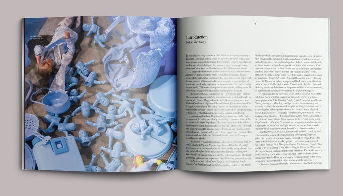
The page’s underlying structure is a grid of eight columns by seven rows. Main texts such as the introduction, shown here, are set in two columns of four units each, with a sink of one row on top for headings and captioning. Two fallow lines separate the top row from the top margin, which is reserved for page numbers and folios.
7.
Introduction, cont’d
Introductory pages showing images in the main text area, with captioning in the top row.
8.
Section opening
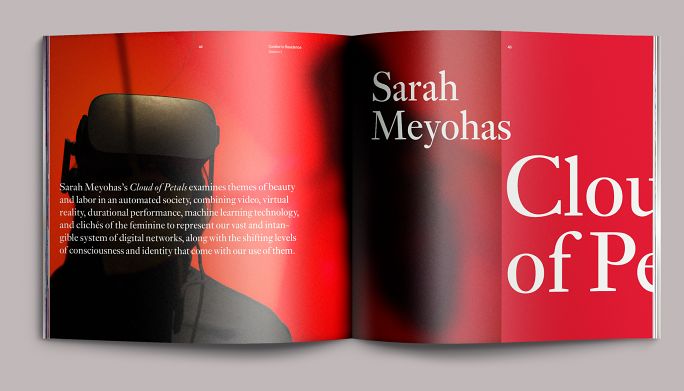
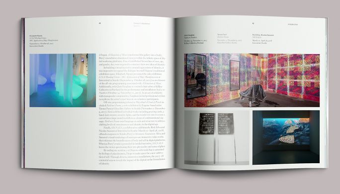
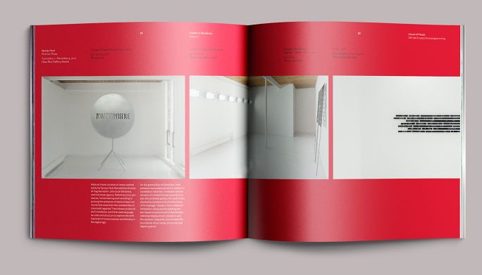
Each exhibition in the season had a color motif: fuchsia for A Situation of Meat, red for Cloud of Petals, blue for Flood, and a blend of chroma-key blue to chroma-key green for Chromatic Saturation. The opening pages of each section reprised these colors as well as the dynamically set type from the exhibition title wall. We paced these sections in the same sequence that they would be encountered on-site, moving the eye from one part of the exhibition to the next as if the book were a window.
9.
Section essay
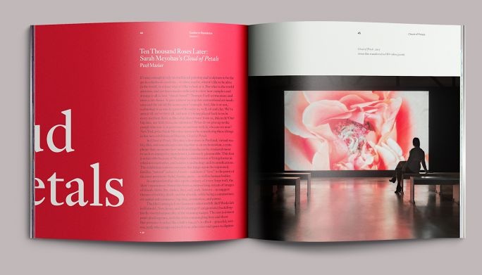
Accordingly, the title type and key color flows onto the first pages, where the essay also begins, then into the first part of the installation . . .
10.
Installation view
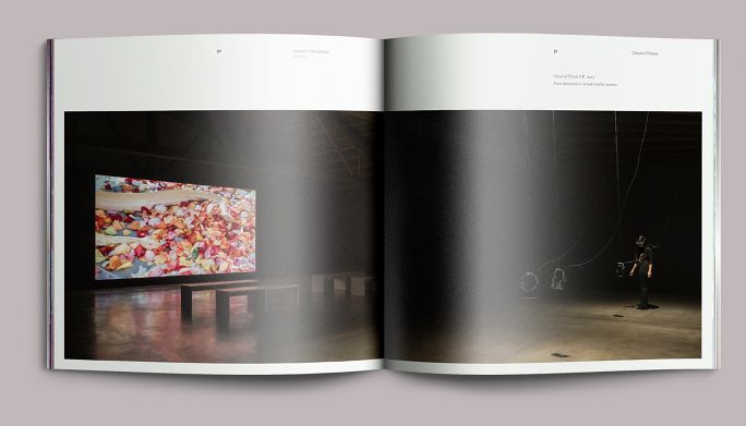
. . . and on out again. Both photographers—Disjecta’s Mario Gallucci and Greenway’s frequent collaborator Joe Freeman, whose image is shown here—are fond of the panoramic format, which turned out to be well served by the square proportions of the text.
11.
Supportive programming
For documentation of programming related to an exhibition but presented outside of Disjecta, we brought the exhibition key color back into the ground and presented the synopsis in small columns in the page’s lower third.
12.
Supportive programming: essay
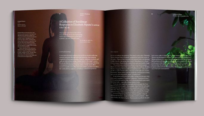
Elizabeth Mputu’s performance sanza required a different treatment. Part of the opening exhibition A Situation of Meat, sanza was both related programming and considered by Greenway to be integral to that exhibition. It receives a synopsis for context (as it couldn’t be shown integrated with that show’s visual work) and an essay. We ran Mario Gallucci’s moody documentary images large and reversed the essay out of them.
13.
Installation view
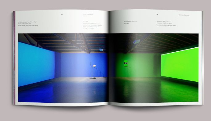
View of Sondra Perry’s Chromatic Saturation in a panoramic treatment, here showing direct captioning in context. The blues and greens here would have been very difficult to reproduce using traditional process offset, but printing the pages directly from the retouched RGB source images gave a surprisingly good result.
14
Supportive programming
Programming in support of Chromatic Saturation, showing blue-to-green gradient background.
15.
Custodial pages
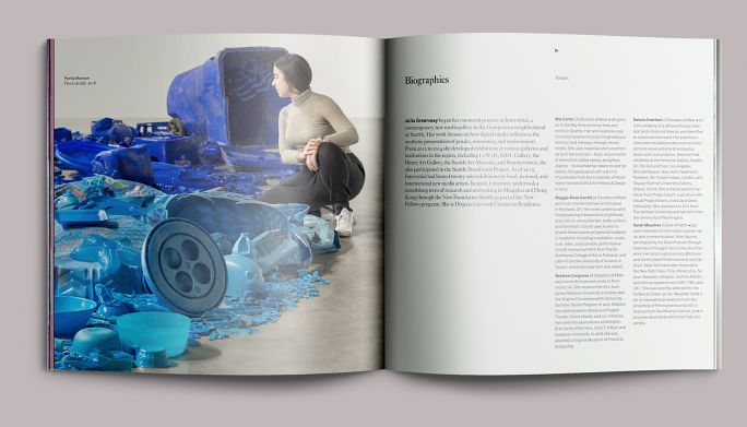
Pages showing treatment of custodial information; here, the contributors’ biographies. That’s actually Greenway in the image; she was pressed into service as a scale figure during documentation, and her placement here, next to her own biography, was a lucky break.
Colophon
84 pp. + cover
8.125 × 8 in., ed. 300
Printed in 4c/4c digital (text) on matte coated paper, and 1c/1c offset (cover) on Kromekote C1S
Composed in Monotype Ehrhardt and Monotype Classic Grotesque
- Editor
- Allison Dubinsky
- Essays
- Ellie DiCola
Julia Greenway
Paul Maziar
Minh Nguyen - Photography
- Mario Gallucci
Joe Freeman
Jules Bianchi - Printing
- Premier Press