Dr. Bronner’s: Packaging reset
Works
- 2014
- Brand, identity, etc.
- Dr. Bronner's
- Packaging reset
From 2014 through 2016, Sibley House was privileged to work with Studio Jelly on a comprehensive reset of the iconic packaging of Dr. Bronner’s soaps, laying the groundwork to develop a unified communications platform recommitted to the free-range humanist philosophy of the company’s founder.
Note: This is a very long story because it was a very long project, stretching over two years, touching hundreds of products, and marking the first time this sixty-eight-year-old “heritage brand” had employed outside creative. Hereafter, when I use the term “we,” I do not mean Sibley House. In the main, “we” refers to a group comprising me, designer Alex Harris, and writer Kathleen Lane, led by creative director Jelly Helm; this was and remains a Studio Jelly project, to which Sibley House was privileged to be attached. Often, “we” will expand to include a large group of Dr. Bronner’s stakeholders, including but not limited to its marketing group (Christina Volgyesi, Karina Tettero, Marty Kenney), its Cosmic Engagement Officer (David Bronner), and its president (David’s brother Mike).
Established in 1948, Dr. Bronner’s is the top-selling soap in the US natural goods market. If you don’t know it by name, you may recognize the label. Early in the project, if I happened to mention to someone that I was working on Dr. Bronner’s packaging, the reply would usually be, “You’re not getting rid of the little type, are you?”
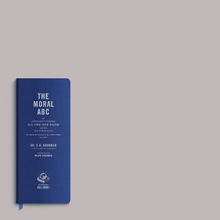
That “little type” is The Moral ABC of All-One-God-Faith, a plea for unity across ethnic and religious divides and a wide-ranging discourse on hard work, personal responsibility, and social engagement, culled from every major religion and mixed liberally with the gospel of free enterprise. It was the life’s work of Emanuel Bronner, a third-generation German soapmaker who emigrated to the United States in 1929.
He began preaching what would become The Moral ABC in Chicago during the Second World War, and later in Los Angeles. He knew how to make soap, and so he did, handing it out at his lectures, each bar of pure castile wrapped in a label crawling with his ideas. The soap was so good that soon people showed up at his lectures just to get it; it was the delivery mechanism for The Moral ABC.
There is much more to the story—how Dr. Bronner’s became beloved of the ’60s and ’70s counterculture, how his sons and grandchildren grew the company into one of the leading lights of the fair trade and organic products market, how the company—family-owned since the beginning—turns its profits into good works in its community and throughout the world.
But this is all by way of saying that while Dr. Bronner’s makes some of the world’s best soap, the brand is and has always been The Moral ABC. We weren’t getting rid of it.
To the contrary: we doubled down. Every aspect of this project started with a recommitment to using The Moral ABC—not as quaint entertainment or mere typographic texture, but in its former status as the conceptual frame for the company’s products—and to presenting it as clearly and legibly as possible.
Illustrations
1.
Reset, not rebrand
There was nothing wrong with the Dr. Bronner’s brand. The products had an excellent reputation, the company made plenty of money—enough to offer their employees a humane compensation package (5:1 executive salary cap, up to 25 percent of salary as a bonus every year, 15 percent of salary as profit-sharing for retirement, and 100 percent free health care for themselves and their families) with enough left over to fund fair trade projects and various other social works—and it was growing, gradually and organically, year-over-year. The brand was doing fine.
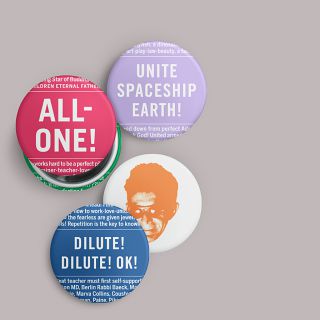
What we could help with was execution and clarity: looking at the product line, deriving a system from it, and reapplying that system back along the line so that the brand’s voice was strong and consistent. Its lodestar was The Moral ABC and its selah, the exclamation “All-One!” which we featured in the service mark and, often, on its own.
The hands-and-globe service mark appeared as a T-shirt in the 1980s and made its way onto labels shortly thereafter. (Its design referenced a line from Dr. Bronner’s poem “Carry on the Moral ABC!”: “There are brave souls who dare to dream that men are brothers and not foes; that hands may clasp across the seas to common good, to common woes.”) Dr. Bronner’s in-house designer Marty Kenney aligned it with Metatron’s cube, a piece of sacred geometry that contains all the platonic solids, and Alex Harris painstakingly redesigned it to work at any scale. For corporate and ceremonial use, we added thirteen stars at several of the cube’s nexuses: twelve six-pointed stars, which might represent any of a number of numerological referents (including the Twelve Tribes of Israel), and one larger nine-pointed star at the pole, representing the All-One.
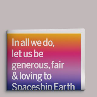
The company’s statement of purpose (internally referred to as “the prayer”) was new to its packages and grew out of an effort to express its values—fair trade; organic and regenerative farming; no animal testing; minimal, recycled packaging; etc.—in an elegant manner. What began as a list of specific policies was condensed into two sentences that, while not being canon Moral ABC, would be right at home there. The prayer now signs off every Dr. Bronner’s package and communication.
2.
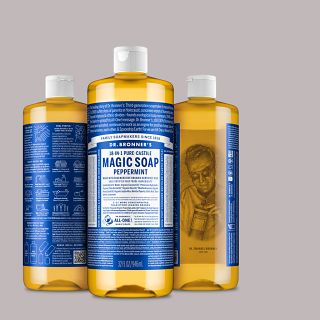
The quart bottle

The Dr. Bronner’s quart bottle as we know it likely debuted in the mid to late 1960s (even the Bronner family doesn’t know for sure), and the Doctor took full advantage of every square inch of it. Although his flagship product was peppermint liquid castile soap, he spread the corpus of The Moral ABC across his entire product offering, often using one label to refer to another (e.g., “see 8,000 words on Sal Suds gallon!”).
It was a living document. With each reprinting, Dr. Bronner fussed, augmented, and edited, perfecting his writings until his death in 1997, whereupon his son Ralph collected all of them under one cover. This—carefully proofed and copyedited (while retaining the Doctor’s unique diction)—became the canonical Moral ABC, and the basis for our work.
Now the challenge was to get as much of it onto each label as possible and have it be reasonably legible. We knew the type would be small, but an average middle-aged person should be able to read all of it without too much trouble. Referring to a bottle from the early 1970s for precedent, we chose Tobias Frere-Jones’s Benton Sans as the primary typeface: it is derived from the realist sans serifs used on the older bottles, and its wide variety of weights and widths gave us greater freedom in copyfitting without electronic distortion.
3.
The product panel

We grouped all of the product information into one chunk and standardized the messaging hierarchy. Previously, the top line on all of the Dr. Bronner’s products was “Dr. Bronner’s Magic Soaps.” In recent years, the company has moved back into foods—their fair trade and organic coconut oil is a huge seller. To maintain clarity across all products, we chose to move “Magic Soaps” down to the product logo (changing this to “Magic Foods” as needed), and lead with only “Dr. Bronner’s” composed in Futura bold, in a nod to the original 1948 Dr. Bronner’s label.
The curving banner was introduced in the early 2000s to highlight a given product’s special quality: “Certified Fair Trade,” “Made with Organic Oils,” and so on. We moved that information into a dedicated feature and benefit area below the product name and repurposed the banner to read “Family Soapmakers since 1858” on all non-food products to underscore the fact that Dr. Bronner was a real person, and this has been and remains his family’s business.
Every product is punctuated by the hands-and-globe service mark and the company’s statement of purpose.
4.
Instructions & certification

We reserved the area to the right of the product panel for usage directions—Dr. Bronner’s liquid soap is highly concentrated and can be used at different dilutions for a wide variety of tasks (hence “18-in-1”)—and a compact declaration of certification. Certifications are important in the natural products market, and products are often studded with different logos. We grouped them all in one area so that a customer would know at a glance exactly where a given product stood.
5.
Color system

The original Dr. Bronner’s label was black and gold; Dr. Bronner changed the colors of his liquid soap label to blue and white—the colors of the Israeli national flag—shortly after Israel declared statehood in 1948. Blue has been the color of Dr. Bronner’s peppermint soap (and the Dr. Bronner’s company) ever since.
Exactly which blue, however, was never specified. The company’s label printers had ink formulations named “Dr. Bronner’s blue” and “Dr. Bronner’s green” and so on in their formula books, sometimes matching decades-old samples.
Studio Jelly designer Alex Harris rationalized the company’s color system, moving it to the Pantone standard and subtly shifting colors closer to their natural analogues—making the citrus label more orange, changing the almond to a flatter green than the hunter’s green traditionally used, and so on.
6.
Extrapolation

Though the iconic 32oz bottle was our starting point, the bulk of our effort went toward establishing rules that could be applied harmoniously across Dr. Bronner’s entire product line. A 4oz bottle shouldn’t read as a scaled-down quart; it should be optimized to its own proportions and offer its own experience of The Moral ABC. These labels are designed to be read. People will read them—in the shower, while brushing their teeth—sometimes the Dr. Bronner’s bottle is the only piece of reading material available.
7.
Extrapolation

This approach applies to the rest of the product line. Each product received its own excerpt from The Moral ABC, even if—as in the case of lip balm—there was room for just a line or two.
8.
Toothpaste

Everything shown here existed in some form prior to our engagement, and though we revised the packaging for Sal Suds (below) extensively, the only product we packaged from scratch was this toothpaste, which Dr. Bronner’s had been working on for years and brought to market toward the end of 2014. It gave us the opportunity to see if the standards language we had been developing for the rest of the product line (see figure 10) was real and not merely a collection of rationalizations.
The product has done even better than Dr. Bronner’s projected; moreover, its packaging has both been celebrated by Gwyneth Paltrow’s Goop, and shown up in the bathroom of the Immortal Iron Fist on season 2 of the Netflix series Iron Fist.
9.
Outliers: Sal Suds

Sal Suds is a powerful and flexible household cleaner and degreaser. It can be used on cars, dishes, and hardwood floors, and is an excellent laundry detergent, but it is not meant for use on humans or other animals. Those who know about it swear by it, but those people are few: it has always been an outlier in the Dr. Bronner’s product range. In repackaging it, we observed the same basic rules as on other products but applied them so that Sal Suds would not be mistaken for a body care product. The label does include a healthy excerpt from The Moral ABC—an only slightly abridged version of the Doctor’s extended riff on Confucianism—but with a much greater allocation for usage instructions and an extensive ingredients manifest written by David Bronner in plain English, wherein you can actually learn what each ingredient is and does and where it comes from.
10.
Outliers: coconut oil
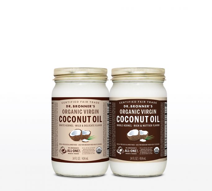
Dr. Bronner’s grows much of its own fair trade and organic coconut crop in a joint venture with local Sri Lankan farmers called Serendipol. Much of the resulting oil is used in its soaps, but the quality is so high that some is reserved for sale as food. This package uses several visual cues to tie it back to the general Dr. Bronner’s product language: there is no “Family Soapmakers” banner, but the “Certified Fair Trade” feature is curved to refer to it. The curve is repeated at the bottom in a nod to traditional food packaging and also to provide enough clearspace for the USDA weights and measures declaration standard.
The label carries the company’s statement of purpose, as do all Dr. Bronner’s products, and the “Magic Foods” variant service mark. It also shows the USDA Organic logo on the front, which is important enough to consumers to rate that placement. There is also text from The Moral ABC—vertically and on either side of the product ID, in a nod to the historic soap labels—and as infill on the side panels.
11.
Style guide

We wrote a thirty-page document whereby anyone with patience, desire, and mid-level production skills can execute a Dr. Bronner’s label. It’s a process—rather than specifying actual measurements, we define the various parts of the label in terms of proportional units derived from the product name’s stroke width—but it’s a philosophy, too: the text concerns such topics as how to approach The Moral ABC, the moral necessity of measuring in picas and points, and so on. It might be our favorite piece in this whole body of work, but unless you work at Dr. Bronner’s, you will probably never see it. We may be violating an NDA by even publishing this picture.
Colophon
Various sizes
2- and 4-color flexography on recycled polyester label stock with matte laminate
Composed in various weights of Benton Sans and Trade Gothic No. 20
- Agency
- Studio Jelly
- Creative director
- Jelly Helm
- Designers
- Adam McIsaac
- Alex Harris
Marty Kenney - Writers
- Kathleen Lane
Adam McIsaac