Dr. Bronner’s: Magic Soap
Works
- 2025
- Brand, identity, etc.
- Dr. Bronner's
- Liquid soap revision
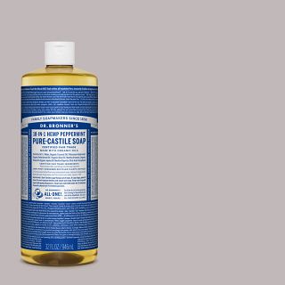
In 2025, we again worked with Jelly Helm on Dr. Bronner’s flagship product, 18-in-1 Pure-Castile Magic Soap. I had thought once we had reset the company’s entire product line in 2015 that it would more or less stay as it was for, say, the next 20–40 years, as that had been the interval since the last time Dr. Bronner’s addressed its packaging. But in 2024, California instituted a new recycling standard requiring that we reduce the size of the label by about 25%, to increase the recyclability of the bottles.
For a label that boasted at least 2,500 words, this wasn’t going to be easy. There was no way we were going to be able to keep it all. At the same time, Dr. Bronner’s was facing stiff competition from private-label soapmakers, who used a similar bottle shape filled with inferior product at a lower price point. (Dr. Bronner’s is so concentrated that it shouldn’t really be liquid; the product’s ability to retain liquidity at high concentration is a trade secret and means that a bottle of Magic Soap will last much longer than a garden-variety castile soap.)
Illustrations
Now 25% smaller!
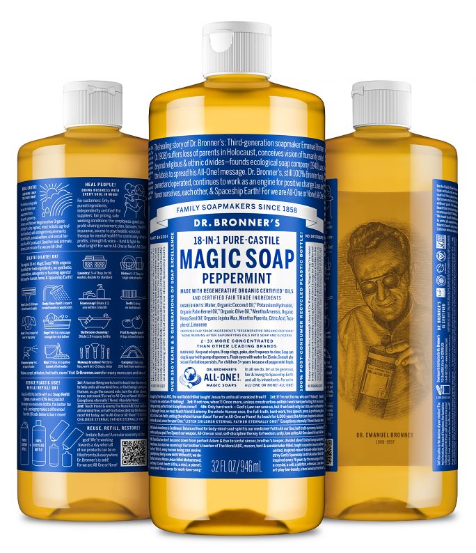
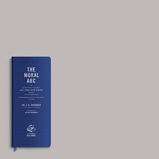
In what might have been a tedious, soul-crushing exercise in making something large fit in a small space, Helm saw an opportunity to refresh the brand at the same time we shrunk the label. So we added a family/company history, a pithy section about the company’s values, and clear illustrations explaining the soap’s 18-in-1 (and more) uses and introducing Dr. Bronner’s refill/recycling program. We also kept plenty of Dr. Bronner’s Moral ABC, the founder’s visionary language, which, Helm writes “remains as potent, vital, and enigmatic as ever.”
The label’s reduced size opened up free space on the back of the bottle (previously, it had almost completely covered it). Leo Helm pointed out to his father that we might use the bottle as a lens to “correct” an anamorphic portrait of the Doctor Himself, printed on the inside of the label.
Finally, after years of the company referring to the product in print as “Dr. Bronner’s ‘Magic Soap’” we convinced them to make “Magic Soap” the name of the product, creating a clear brand difference between the generic castile soaps with which it now had to share shelf space.
Colophon
Various sizes
2- and 4-color flexography on recycled polyester label stock with matte laminate
Composed in various weights of Benton Sans, ATF Alternate Gothic, and Trade Gothic No. 20
- Agency
- Studio Jelly
- Creative director
- Jelly Helm
- Designers
- Adam McIsaac
- Illustrator
- Elise Furlan