Loss of Material Evidence
Works
- 2018
- Books / editorial
- Lewis & Clark College
- Loss of Material Evidence
Catalog for an exhibition by the artists Maria T. D. Inocencio and Mark Smith, who have been partners in life and art since meeting at the Cooper Union in the early 1980s. Loss of Material Evidence presents work the two have created both individually and collaboratively in response to the aging and eventual passing of their parents, presented in 2018 at Lewis & Clark College’s Hoffman Gallery.
The book is a product of—rather than a companion to—the exhibition. Most of the photography was done shortly before the show opened and is organized to give a sense of movement through the galleries. Though it is freighted with cues to the artists’ work—the pink cloth and striped endbands refer to Smith’s long-standing use of bright thrift-store fabrics in his wall pieces, for example—the overall presentation is quiet and restrained. The book sits comfortably in the hand; large details and wide-format works are accommodated by gatefolds. Curator Linda Tesner’s essay is printed in dark gray with a dull base so that it recedes into the page, and its illustrations track the text closely, eliminating the need to flip back and forth. At book’s end is an extensive illustrated CV, with the artists’ chronologies presented parallel to one another: Smith in magenta, Inocencio in cyan, and their collaborations in a combination of the two inks.
Illustrations
1.
Cover & dustjacket
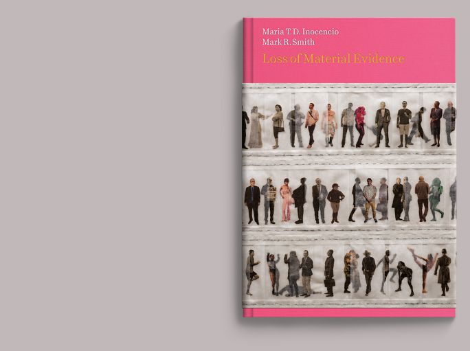
Despite its elegiac subject, much of the exhibition is vivid and colorful. The book is bound in pink cloth: a three-quarter-height dust jacket features a detail of the collaboration I Used to Think I Knew Everyone (2017).
2.
Endsheet & half-title
The bright coloration carries into the interior, though the overall presentation is quiet and restrained. The book is humanely scaled and sits comfortably in the hand; its binding is sewn and its back rounded for flexibility. It is printed on a coated dull stock, with the main text in gray ink with a dull base to reduce page shine.
3.
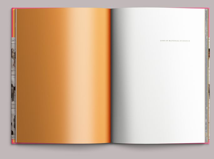
Main title
Installation of Receding View (2017), a monumental quilt spread over a single bed and much of the gallery floor. Loss of Material Evidence is composed principally in Matthew Butterick’s Century Supra, an elegant—though still gimlet-eyed—revision of M. F. Benton’s 1919 workhorse, ATF Century Schoolbook.
4.
Introduction
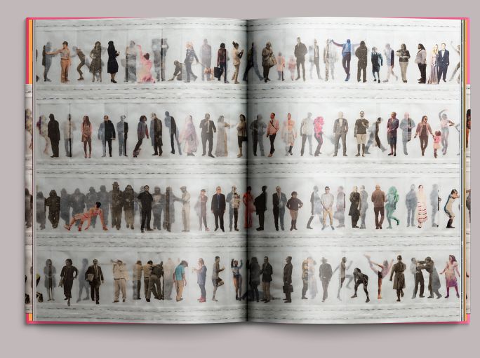
The artists’ daughter, Rosa Inocencio-Smith, an editor at The Atlantic, contributed a tribute to her parents, which we placed in the middle of a joint portrait of her mother . . .
5.
Introduction, continued
. . . and her father, at the end of the book’s introductory section.
6.
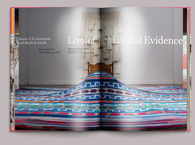
Section divider
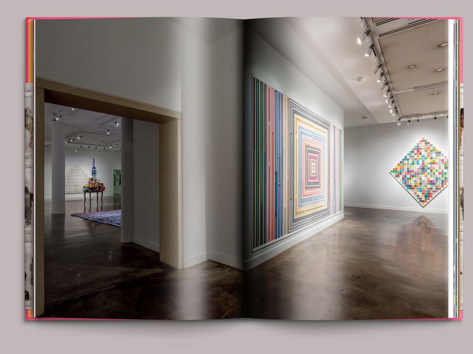
The pacing of Loss of Material Evidence is based on a visitor’s movement through the galleries. Installation images like this one, used two or three in sequence, create the book’s four divisions, panning the room before moving in on the work that starts the next section.
7.
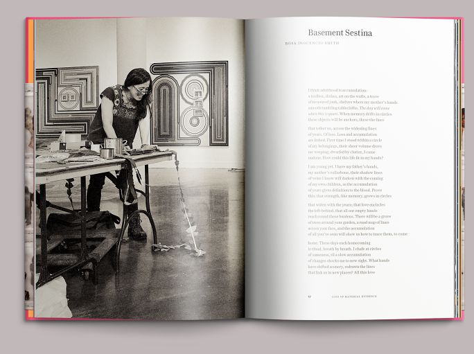
Essay opening
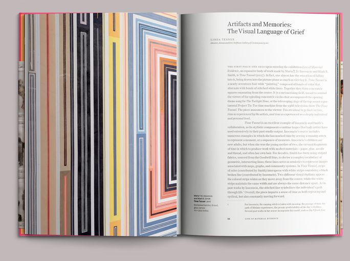
An essay by Linda Tesner, the curator of the Hoffman Gallery, runs the length of the book and is illustrated in context; the book has no traditional plates section. Scaling Loss of Material Evidence for the hands rather than the coffee table required accommodation for the artists’ more expansive works. Though the sewn binding is flexible, the gutter would still exact tribute from crossovers.
8.
Essay opening with gatefold
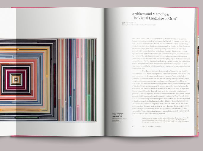
For works where that would be unacceptable, we built in gatefolds. There was no way to show Time Tunnel at a reasonable scale in a book of this size, but a single fold placed dead center is less jarring than losing most of the center square in the binding. In fact, finding the optimal way to accommodate Time Tunnel (together with a comfortable measure for the essay) formed the basis of the book’s proportions and architecture.
9.
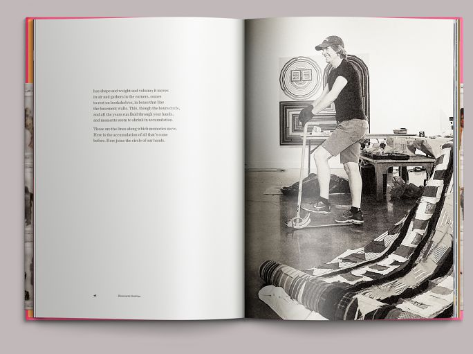
Essay interior
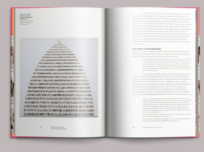
If you can swing it, adding a plate just for text can be more than a luxury: freeing the text from the black plate means that black is wholly given to process color, mitigating any density trade-offs between type and reproduction. Here, we also wanted to push the text back a bit, making the experience of reading a bit quieter. We specified a dark gray mixed with a dull base. Images were hit with a spot gloss varnish, moving them forward optically on the page.
10.
Detail
Reprise of detail from I Used to Think I Knew Everyone (2017) from the book’s dust jacket.
11.
Essay interior with transition detail
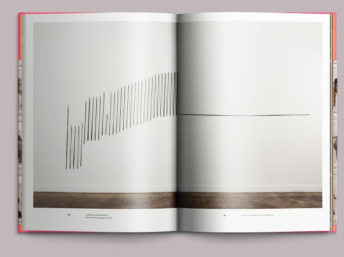
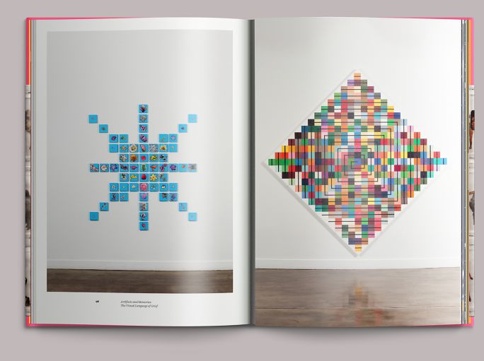
Three levels of attention come into play in Loss of Material Evidence: a broad view of the exhibition (noted in figure 6); individual pieces, presented in full and in detail; and intimate details showing the tremendous amount of physical labor Inocencio and Smith put into the works.
12.
Installation
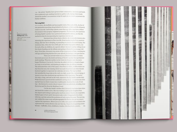
Here, a happy coincidence in which the phase transition of Inocencio’s Waiting to Cry (2016) conveniently occurs in the gutter.
13.
Installation with gatefold
Whenever possible, we presented the artists’ work in relative proportion, as shown here and in figure 12, and with a common origin: note the floor and baseboard.
14.
Installation with gatefold, open
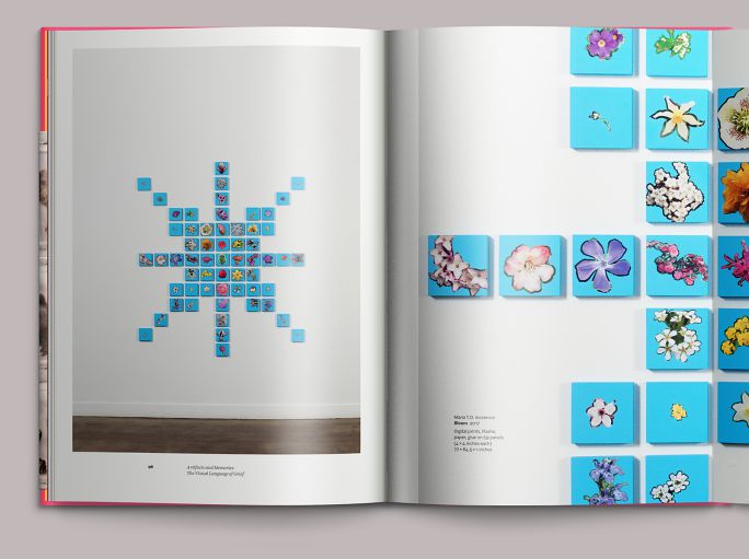
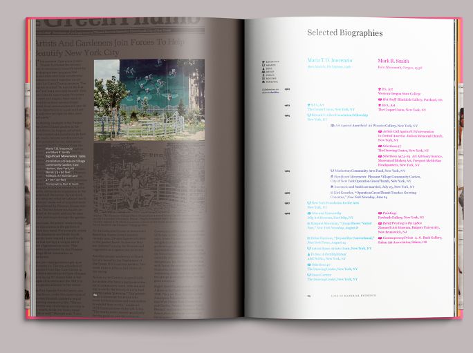
We also used gatefolds to show meaningful detail in the context of a particular work. This is Inocencio’s Bloom (2017).
15.
Integrated biography
Rather than presenting the artists’ CVs consecutively, we interwove them into a timeline consisting of two concurrent columns, deviating from the traditional section-based format (Education, Solo Exhibitions, etc.) with a system of icons. Inocencio’s chronology is in the left column, printed in process cyan; Smith’s is on the right, printed in process magenta. Collaborations (including children) are shown in a center column using both inks overprinted. Works from periods referenced in the timeline are shown on facing pages.
Colophon
104pp + cover
7 × 10.25 in., ed. 1,500
Printed in six colors (4c + 2 match) on coated matt paper
Sewn and bound in cloth with dustjacket
Composed in Century Supra and Halyard
- Essay
- Linda Tesner
- Editor
- Allison Dubinsky
- Photography
- Stephen Funk
- Color separations
- Peter Jennings
- Printing
- Print Vision