Portland 2019 Biennial
Works
- 2019
- Books / editorial
- Disjecta Contemporary Arts Center
- Portland 2019 Biennial
The Portland2019 Biennial, presented by Disjecta and curated by Yaelle S. Amir, Elisheba Johnson, and Ashley Stull Meyers, comprised works from eighteen regional artists whose work addresses issues of migration, diaspora, and erasure of communities within the Oregon landscape, and the lingering effects of Manifest Destiny.
Portland2019 was the fifth biennial presented by Disjecta (now Oregon Contemporary) and, arguably, the first to be overtly political in scope. The curatorial team selected artists whose studio practices have been influenced by their relationships to community, the landscape, and regional politics; and from diverse points of view, both ethnic and geographical.
The resulting work was richly varied and independent. As with all of our work for Disjecta, graphic and collateral work was meant to present, not interpret. Interpretation is the domain of the artist and its audience.
Illustrations
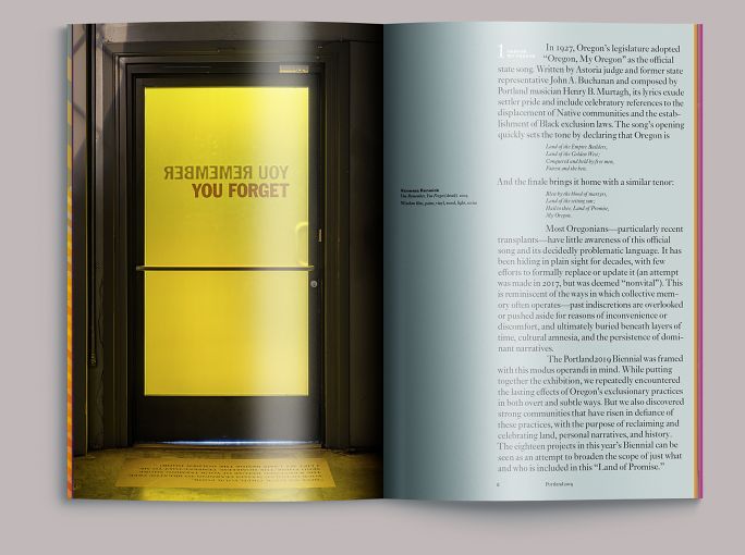
Exhibition entry wall

For the exhibition positioning, we developed a simple framework to address the commonalities among the projects: region (landscape), location within that region (the artist), and movement (activity).
For region, a ground of four squares representing the cardinal directions; three of these we filled with a representative color for each of the curators (turquoise, orange, violet), and then overlaid the whole with a large red dot for the artists. We devised an icon of twenty-one arrows running northwest (one for each of the artists and curators) and echoed its diagonal lines in the Biennial’s date.
1
Cover
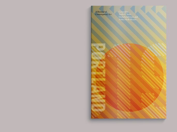
The catalog cover quotes the exhibition positioning: a red dot for the artist’s location, the twenty-one northwest-headed arrows, but the three colors representing the three curators is now a continuous-tone vignette, designed to run the length of the book, so that looking at its edge, you should see the progression from turquoise, to orange, to violet.
2
Frontispiece
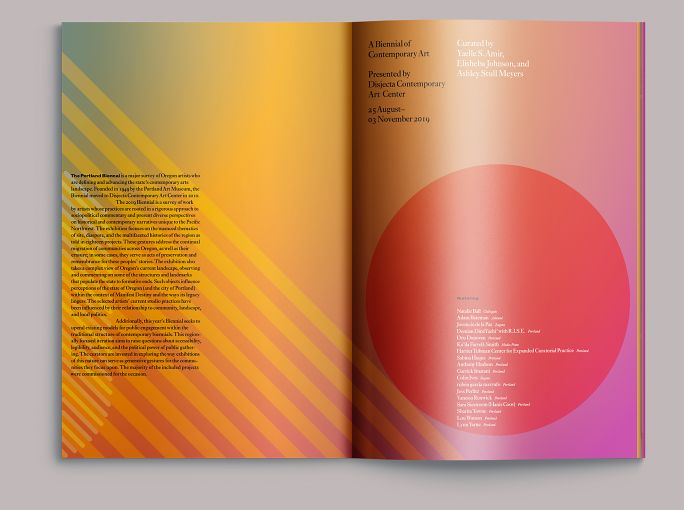
The cover graphic crosses over into the interior; the red dot now contains the names of the exhibiting artists, as on the introductory wall in the gallery.
3
Introduction
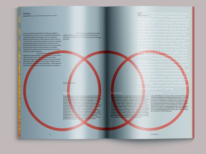
The background vignette begins with turquoise. The dot motif is here represented by three interlocking circles, one for each curator, and containing the curator’s biographical notes.
4
Section opening
You can see the turquoise shifting into green on the next two pages. Typography is handled with the restraint of Disjecta’s brand language, though set somewhat large when showing the voice of the curators.
6
Interviews
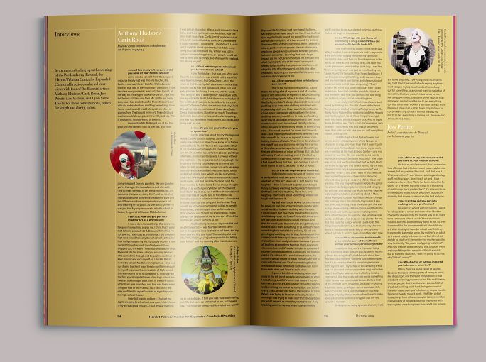
The Harriet Tubman Center for Expanded Curatorial Practice, a group of students from Harriet Tubman Middle School working with the artist and curator Lisa Jarrett, interviewed four of the exhibiting artists, and their contribution to the catalog was the text of these interviews, illustrated and set across several pages.
7
Artist opening
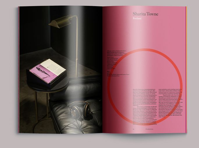
Each of the exhibiting artists received four pages, which was enough to show their work in detail. A typical opening showed a full page image faced with a text page containing a biography set within a red circle.
8
Artist interior

Subsequent pages showed the work in greater detail, with accompanying notes and image sequences.
Colophon
84pp + cover
7 ⅓ × 11 in., ed. 250
Text: 4c digital on coated matt paper
Cover: 4c digital on uncoated paper
Composed in Monotype Ehrhardt, Monotype 150 Bold Extended, Monotype Classic Grotesque, and Antique No. 6
- Editor
- Allison Dubinsky
- Essays
- Yaelle S. Amir
Elisheba Johnson
Ashley Stull Meyers - Photography
- Mario Gallucci
- Printing
- Premier Press