The 2024 Oregon Contemporary Artists’ Biennial
Works
- 2024
- Books / editorial
- Oregon Contemporary
- The 2024 Oregon Contemporary Artists’ Biennial
The creation of Bay Area curators Jackie Im and Anuradha Vikram, ablaze with our care, its ongoing song was the sixth biennial hosted by Oregon Contemporary. Twenty-one regional artists shared work exploring themes of connection and compassion. The book thoroughly illustrates the works and performances over 210 pages—the largest publication Ox has as yet undertaken.
Illustrations
1.
Cover
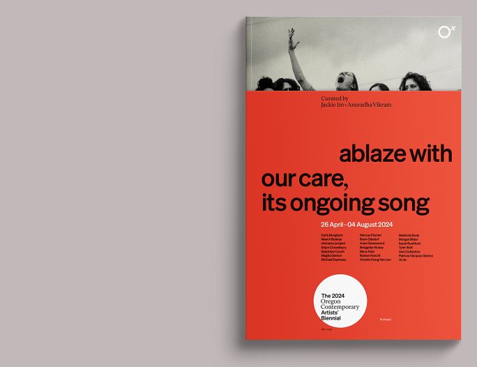
We followed the rationale developed for the organization’s publications with slight variations to emphasize the Biennial’s visual language: the addition of printer’s red to the customary black-and-white text presentation, and a partial inversion of the Ox typographic standards, leading with the sans-serif (Kris Sowersby’s Söhne) we typically reserve for supplementary information.
The uncoated partial dustjacket reveals an image showing Maxx Katz’ performance of Yelling Choir held at Ox on 01 June 2024.
2.
Inside front cover / frontispiece
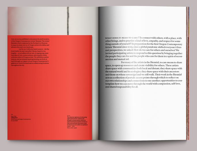
Ox’s publication standards are designed for compression, using as much real estate as humanely possible for images and essays. We do reserve the right to use whitespace for pacing (see fig. 5), but typically we jump into main content on page one, pushing the custodial/ceremonial stuff (copyright, credits, etc.) traditionally handled in front matter to the inside front and back covers. Here, we start with the curators’ thematic statement rendered in large type.
3.
Overview
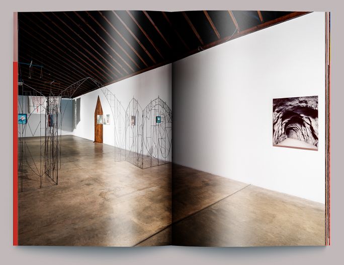
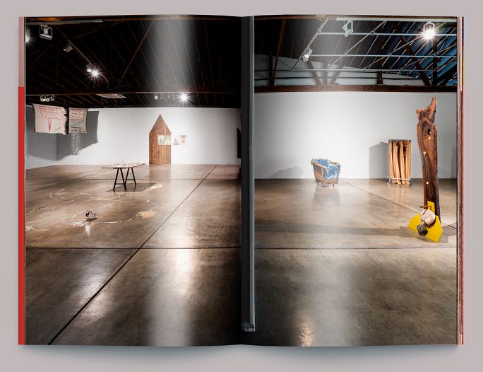
And from there, a complete eye-level overview of the exhibition, played out over several spreads, so that the reader may get a sense of the exhibition as installed before drilling down into individual works. This overview occurs before any other writing is presented.
4.
Overview (continued)
5.
Main title
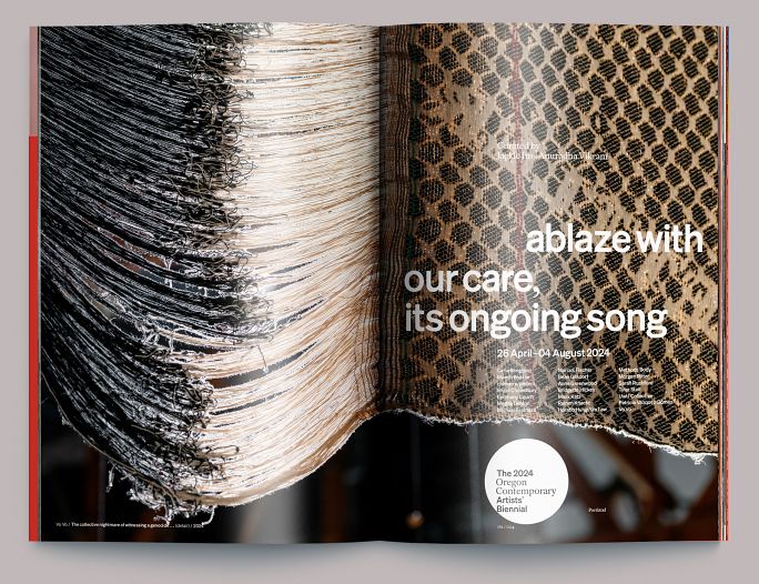
Main title pages, showing a detail of Vo Vo’s 2024 tapestry The collective nightmare of witnessing a genocide but from a distance far enough to remain passive, whilst not quite resolving the question of what our role is and would be when push comes to shove in our own settler occupation/s.
6.
Table of contents
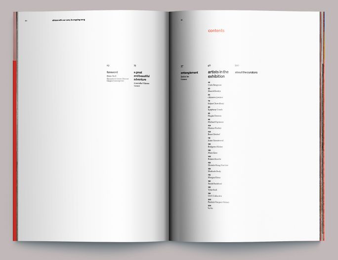
The table of contents is an example of whitespace deployed as a brief cæsura before getting further into the book.
7.
Divider pages
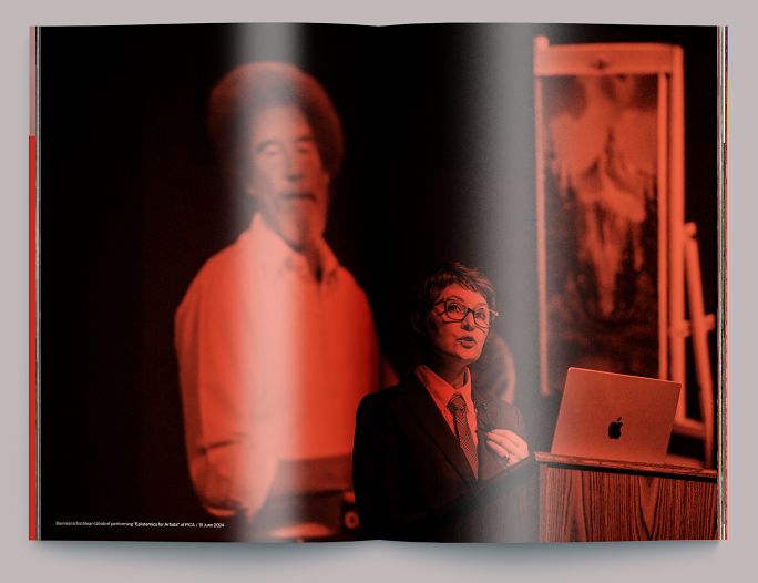
The book’s various sections were broken up by spreads showing performance images rendered in black and white overprinted with the red of the exhibition’s theme. Here is Bean Gilsdorf performing “Epistemics for Artists” on 15 June 2024.
8.
Essay opening
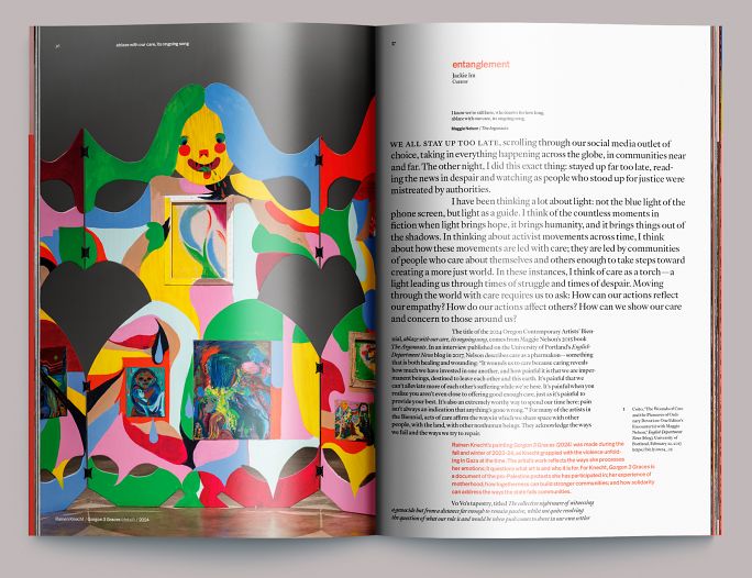
Opening of Jackie Im’s essay Entanglement with a detail of Rainen Knecht’s 2024 work Gorgon 3 Graces. We follow a philosophy of “direct labeling” whenever possible, wherein the artwork is shown as it is mentioned in the text (the paragraph in red references Knecht’s piece) so that the reader gets both image and information at once without having to page back and forth. Footnotes are handled similarly, hanging from the line containing the reference in an exterior column.
9.
Essay (continued)
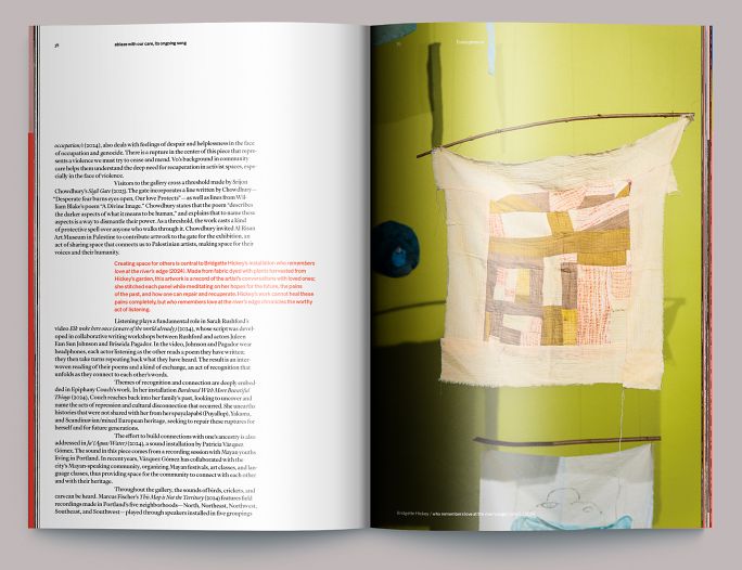
Interior essay pages, here showing a detail of Bridgette Hickey’s 2024 installation who remembers love at the river’s edge.
10.
Artist detail
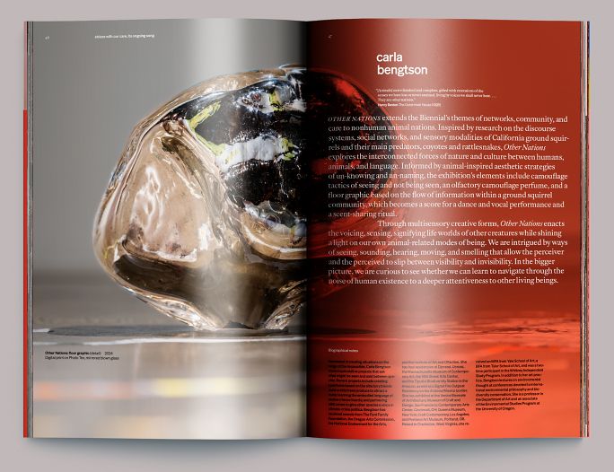
Each contributing artist received full coverage of their contribution, starting with a page or pages overlaid by the exhibition’s theme red, creating a divider and container for the artist’s statement and biographical information. Shown here and over the next several figures is Carla Bengtson’s Other Nations.
11.
Artist detail (continued)
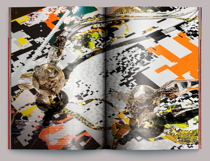
Detail of Ms. Bengtson’s Other Nations showing overlaid notes. Some of the works included in ablaze with our care, its ongoing song contained detailed annotation from the artists. The standards contain a system by which that information could occupy two tiers of space lower on the page, but integrated with the image. This is both a decision of convenience (as much of our photography is in situ) and of philosophy: the documentation is a reproduction and not the actual work; the act of reading and looking is different in a book than in an exhibition and shouldn’t pretend otherwise.
12.
Artist detail (continued)
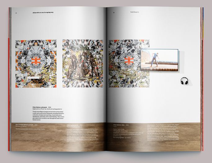
Another example of the annotation system contained in the standards. The in situ photography often contains a fair amount of framing space that we can use gracefully for this purpose. We might not do this in an artist’s monograph, but these books are exhibition documentation, not catalogues in the formal sense.
12.
Artist detail (performance)
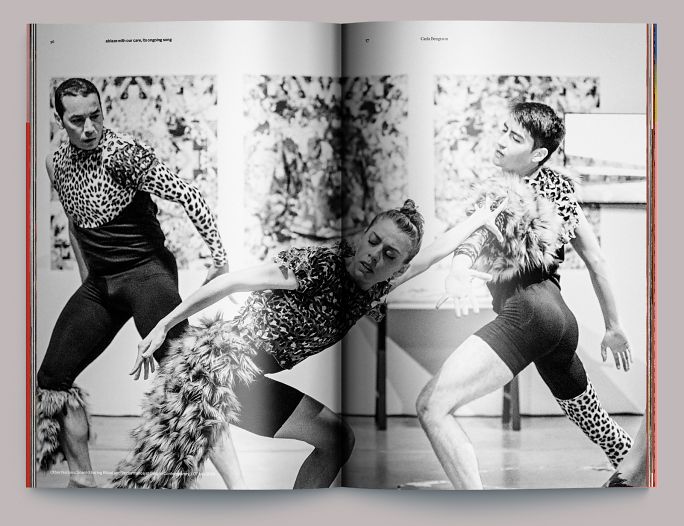
The Biennial featured several performances (here, a scent-sharing ritual as part of Carla Bengtson’s Other Nations). For publication, we graded performance photography in black and white to separate it from the static works and emphasize the ephemerality of the performances.
13.
Section divider
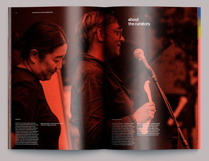
Final section divider with biographies of the curators overlaying a photograph of them presenting the first day of performances.
Colophon
210pp + cover
7 ⅓ × 11 in., ed. 300
Text: 4c digital on Ultra Print Digital Satin 100T
Cover: 4c digital on Ultra Print Digital Satin 100C
Dustjacket: 2 PMS on Finch Vellum 80T
Composed in Immortel Vena and Söhne
- Essays
- Jackie Im, Anuradha VIkram
- Editor
- Allison Dubinsky
- Photography
- Mario Gallucci, Fio Ballerini
- Color separations
- Peter Jennings
- Printing
- Typecraft, Pasadena CA