Disjecta Brand Evolution
Works
- 2017
- Brand, identity, etc.
- Disjecta Contemporary Arts Center
- Brand development
Founded in 2000, Portland’s Disjecta Contemporary Arts Center spent much of its first decade as a pop-up and roving arts organization, offering challenging, visceral events and exhibitions at various places around the city in a kind of counter-programming to established galleries and museums. In 2007, it found its current home, a converted 1953 warehouse in Portland’s Kenton neighborhood, and established permanent programming: the resuscitation of the Portland Biennial (run since 1940 and discontinued by the Portland Art Museum in 2006) and Curator in Residence, a showcase of new curatorial voices that was the first of its kind in the region.
In 2017, Disjecta’s board hired curator Blake Shell as only its second executive director. Realizing that the organization had matured beyond its DIY roots and couldn’t continue to mature by relying on volunteer labor, Shell set about professionalizing its systems, including establishing a benefits program for staff and committing to and receiving certification from W.A.G.E. (Working Artists and the Greater Economy), a national organization advocating and monitoring voluntary adherence to real-market artist fees and honoraria.
Sibley House had consulted with Shell during her tenure as ED of the Art Gym, producing a half-dozen books and miscellaneous exhibition-related collateral. She invited us to help: there was a lot of work to do, not a lot of time, and even less money. Okay.
Illustrations
Logotype reworking / alphabet
I do not know who designed the original Disjecta logo, which was a black square with the organization’s name reversed out in Trade Gothic No. 20; the counters of the D and A were dropped for reasons I suspect had something to do with both the definition of disjecta (from “disjecta membra” meaning scattered remains or fragments) and the organization’s Denver Avenue-facing sign, which had been cut from a single sheet of steel.
When we started work, Disjecta had no existing concerted communications effort. As far as I could tell, it had relied on pro bono help for almost everything, using many different consultants. I suppose we could have done anything we wanted, but as the organization had just undergone a significant staffing change, it made sense to make any changes slowly and subtly.
So: a square with eight letters reversed out. After a few months of working with it, we re-drew the letters so that they matched the proportions of the original Trade Gothic, but followed a geometric model based upon the enclosing square and with squared counters. A small move—which most people likely never noticed—but it gave the device a crisper, more robust presence and spawned the creation of an alphabet and numeral set that we could use for other purposes.
We would also lean into the square as a motif for other applications, as shown below. Work with what you have.
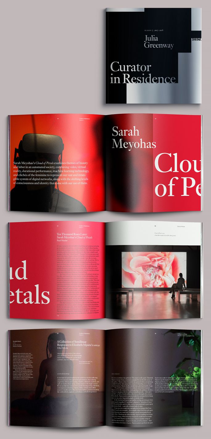
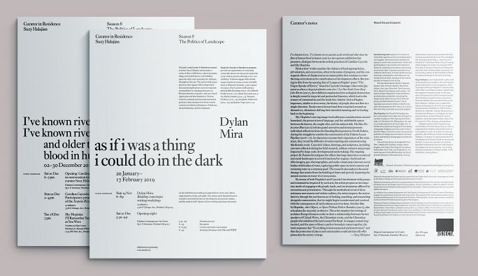
Curator in Residence 7
Julia Greenway’s tenure as Disjecta’s seventh Curator in Residence coincided with Ms. Shell’s arrival at Disjecta. Ms. Greenway had founded and run Interstitial, a well-regarded new media gallery in Seattle’s Georgetown district, and her curatorial practice is concerned with issues of gender, economics, and environment as processed through digital media. Visually, the work she presents tends to be hard-edged, strongly colored, confrontational, and attuned to the ephemeral and slightly seedy nature of digital communication. To her residency, she brought four lively exhibits concerned with issues of gender, economics, and the environment.
Rather than branding the season as a standalone event, we began branding the institution through the work we did to present the season, [neutral frame]. We created a dynamic language of connected and overlapping squares issuing from the institution’s logo, rendered in different colors for each exhibition.
Posters
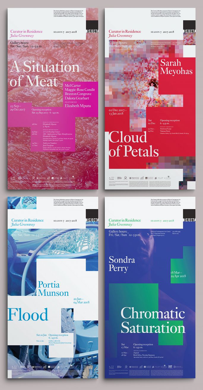
Portland is not really a poster town, but it had been customary to prepare posters for each exhibition in a CiR season, so we did it. These are designed as double squares of 11 × 22 inches; a bit longer than the tabloid size used by bands and other cultural organizations, though the same width so that they could be posted in the same venues (café windows, for example). Each stands on its own, but connects visually with its successor.
Entry walls
Similarly, the entry for each exhibition links up (and occasionally overlaps) with its predecessor, moving down and, by the end of the season, filling the wall. We can’t do this kind of thing anymore, as the organization has doubled its programming and the CiR exhibitions are no longer presented in continuous sequence.
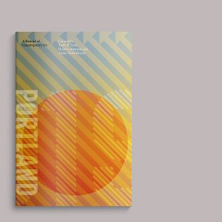
Catalog
Discussed at greater length in a related post, the exhibition document is obviously a square. For a hot minute, we had thought about producing all collateral in the square format, but found it to be impractical. We did carry the Disjecta logo’s square motif forward into work for the organization’s next act, Oregon Contemporary; the new symbol is a circle, but there is a square inscribed within the architecture underlying all collateral pieces, most visibly the truncated dust jackets wrapping exhibit catalogs.
General collateral
Newsletters
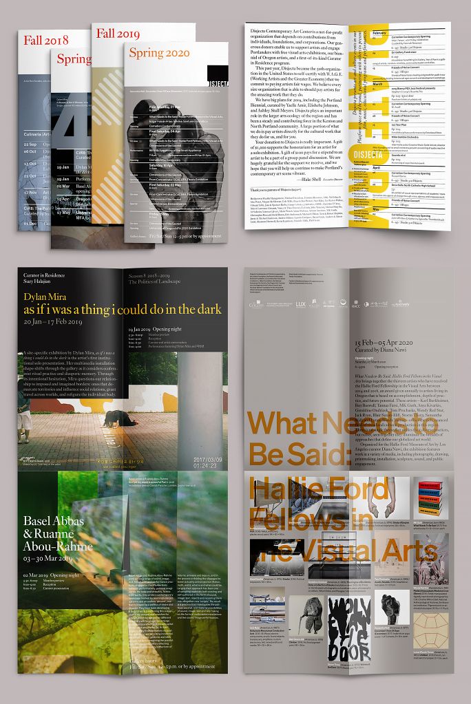
For a year or so after we discontinued the poster program (see above), we used the remaining funds to publish a quarterly newsletter of sorts. It was very nice. But for an organization of Disjecta’s scale, regular publication of this kind presents a couple of problems: first, staff at the time consisted of the ED and an assistant, and there weren’t really the resources available to reliably create content to sustain it. Secondly, our membership was modest enough so that we could never really tell what kind of return we were getting.
Finally, a newsletter doesn’t really serve the artists in the same way that an exhibition-specific postcard can. Exhibiting artists have their own followings, which we could roll into our own mailing list, thereby expanding the reach of both the artist and the institution. Conceivably, we might have done that with the more generalized newsletter, but it doesn’t have the same impact. After a year and a half, we eventually pivoted to a combination of email and large-format postcards, which are still in use today.
Lo-fi gallery guides
When we started, Disjecta was producing four-panel gallery guides in an 8.5 × 8.5 square format. These had to be sent out to print because they required a tabloid-sized printer or photocopier and then had to be trimmed down. The result was an inconvenient size to serve as a souvenir, and we noticed that they weren’t being kept anyway.
So we switched to a standard letter-sized format, relying solely on black type on white paper. Originally, these were two-sided as shown; after the org rebranded as Oregon Contemporary, for accessibility purposes we redesigned the guides using a much larger text setting and allowing them to consume as many pages as they needed. We also installed a laser printer in the Ox office so that they could be produced as needed in-house.
Portland2019 Biennial
Portland2019 was the first biennial held under Ms. Shell’s tenure, and was run by a trio of young northwest curators: Yaelle S. Amir, Elisheba Johnson, and Ashley Stull Meyers, and comprised works from eighteen regional artists whose work addresses issues of migration, diaspora, and erasure of communities within the Oregon landscape, and the lingering effects of Manifest Destiny.
Portland2019 was the fifth biennial presented by Disjecta and, arguably, the first to be overtly political in scope. The curatorial team selected artists whose studio practices have been influenced by their relationships to community, the landscape, and regional politics; and from diverse points of view, both ethnic and geographical.
The resulting work was richly varied and independent. As with all of our work for Disjecta, graphic and collateral work was meant to present, not interpret. Interpretation is the domain of the artist and its audience.
General ID / entry wall

We developed a simple framework to address the commonalities among the projects: region (landscape), location within that region (the artist), and movement (activity).
For region, a ground of four squares representing the cardinal directions; three of these we filled with a representative color for each of the curators (turquoise, orange, violet), and then overlaid the whole with a large red dot for the artists. We devised an icon of twenty-one arrows pointing to the northwest (one for each of the artists and curators) and echoed its diagonal lines in the Biennial’s date, set in the custom alphabet we derived from the organization’s logo.
Newsletter
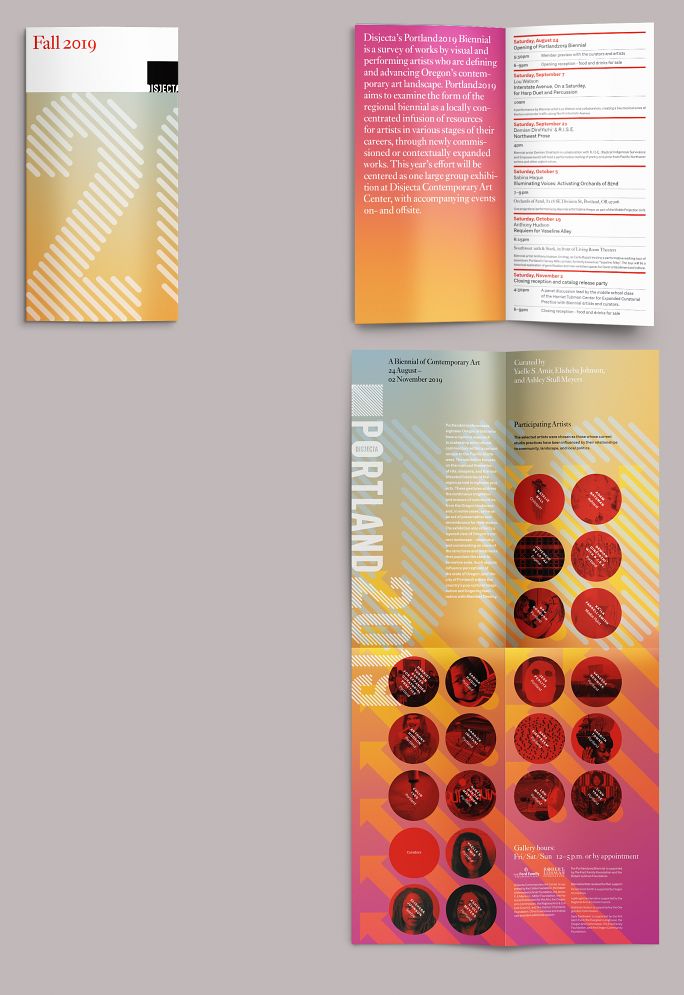
A special publication of the organization’s newsletter, announcing and describing the artists.
Exhibition catalog
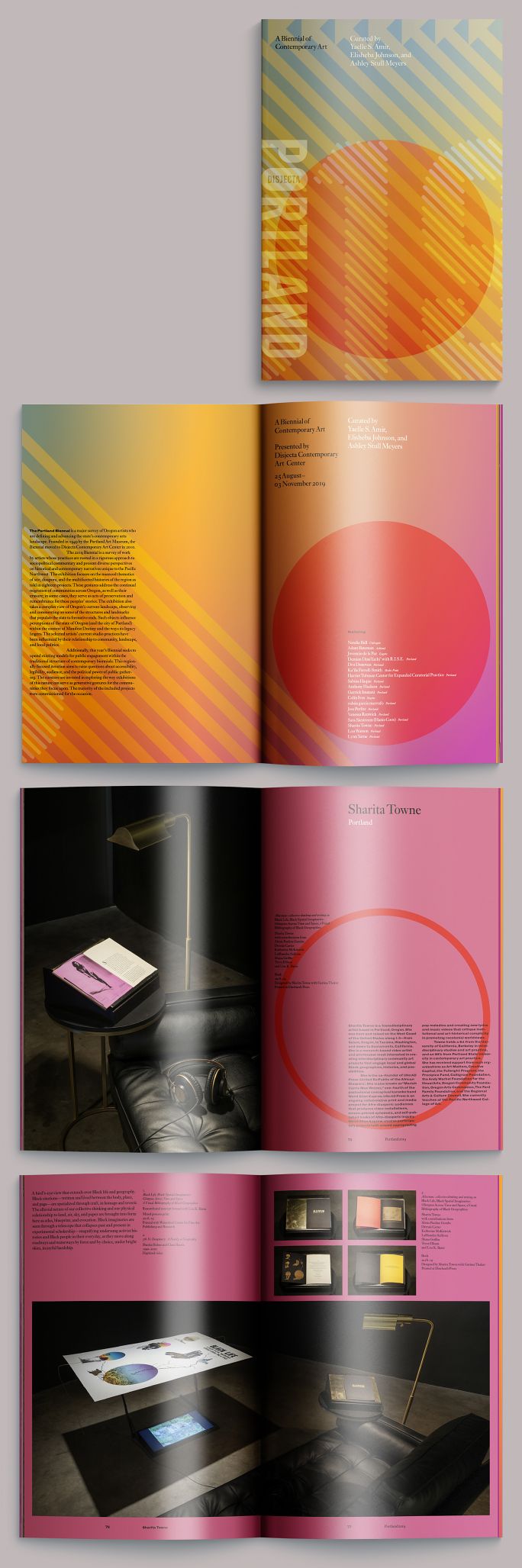
We produced an 84-page catalog documenting the exhibit, which is shown in detail here, and for which we extended the background blend described above so that it played out throughout the book, starting at turquoise and ending at violet, 84 pages later. Not so noticeable page-to-page, but you could see it by looking at the edge of the book block.
Culinaria (Art+Food+Community)
For Culinaria, a programming series pairing local chefs and artists, we created a service identity using the custom alphabet described above, integrating the organization’s name in the counter of the U, which was the first time it had been freed from its enclosing square.
Entry wall
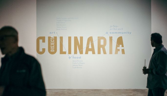
We prepared two executions: a horizontal version meant to be used large (as on the wall graphic shown)…
Menu
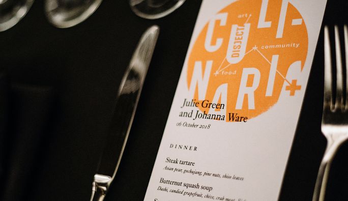
…and a roundel, which could be used smaller; one execution of this was a rubber stamp, which we used on menu cards. (Photographs by Sam Gehrke)
Colophon
Composed in Monotype Ehrhardt and various weights of Classic Grotesque (Monotype Series 215)
- Photography
- Mario Gallucci
- Editor
- Allison Dubinsky
- Color separations
- Peter Jennings